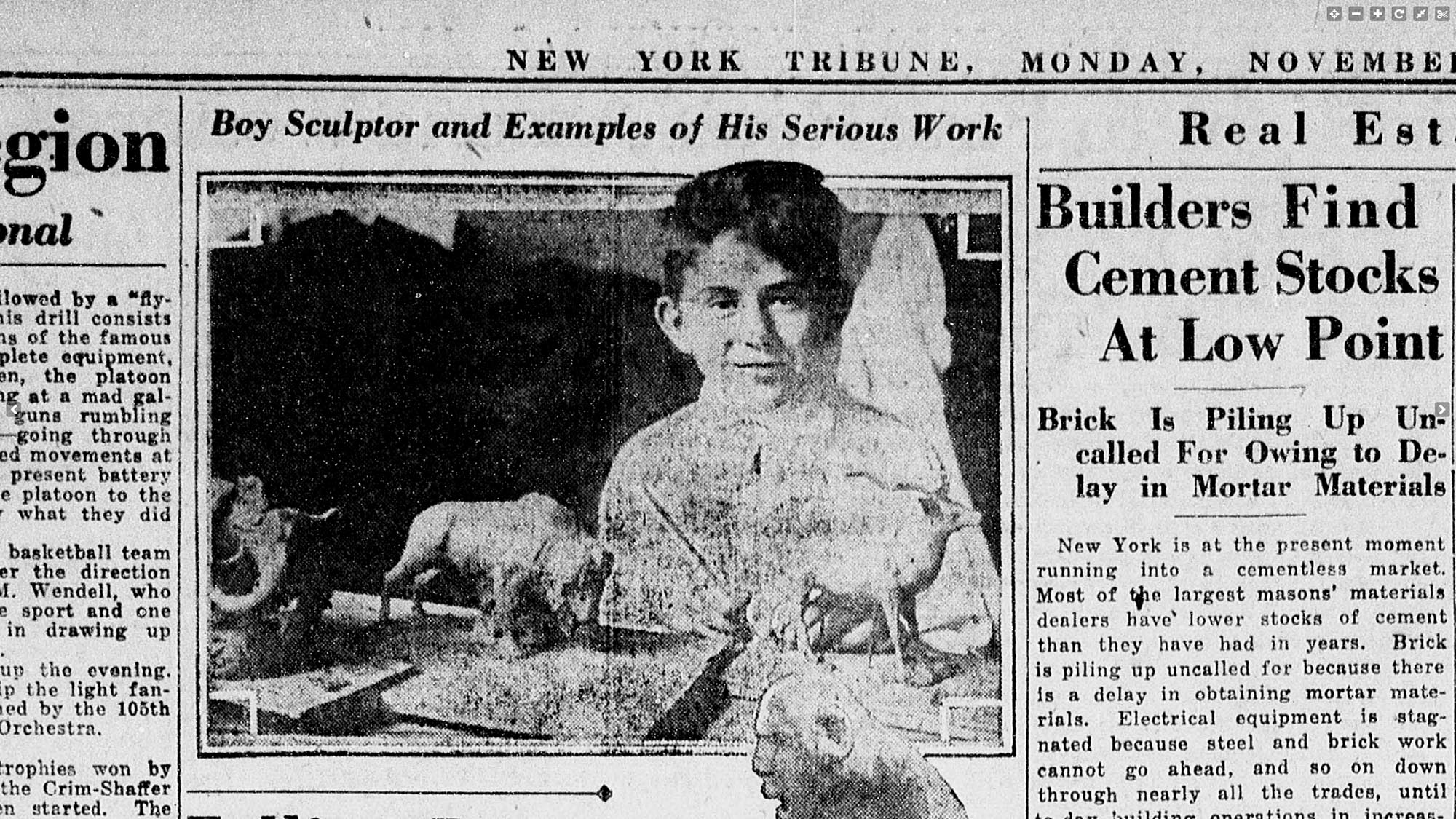
George Kratina, 1910–1980, designer, sculptor and teacher.
Twelve-year-old George Kratina in the New York Tribune, November 6, 1922. Library of Congress.
In 1922, newspapers across the country enthusiastically dubbed boy-sculptor George Kratina from Brooklyn a “budding genius.” Kratina’s father, a successful sculptor, who had studied with Rodin in Paris, and mother, a landscape painter, encouraged and supported their son’s aspirations. Geroge Kratina worked his way through college doing sculpture, getting his bachelor’s and master’s degrees from New York State College of Forestry at Syracuse University. “I took up forestry, not because I was going to become a forester, but because it was a good education and I felt I needed a general education.”1Myers, Arthur, A Sort of Davy Crockett: With Rubber and Plastic, an Old Chatham Artist Carves a Tribute to Chattanooga’s Pioneer Past, The Berkshire Eagle, Pittsfield, MA, December 15, 1962, p. 14. He then studied design and sculpture at Yale. He competed in “sculpturing” in the 1932 and 1936 Olympics, in Los Angeles and Berlin respectively, when fine arts were still a part of the games. He taught at Cooper Union and Rensselaer Polytechnic Institute. Architect John Heyduk recalled Kratina as a “passionate teacher who never saw anything bad in your work, he always pulled out whatever was good in it.”2ARMADILLO: John Heyduck. A taped interview conducted by Pere Eisenman in the fall of 1977.
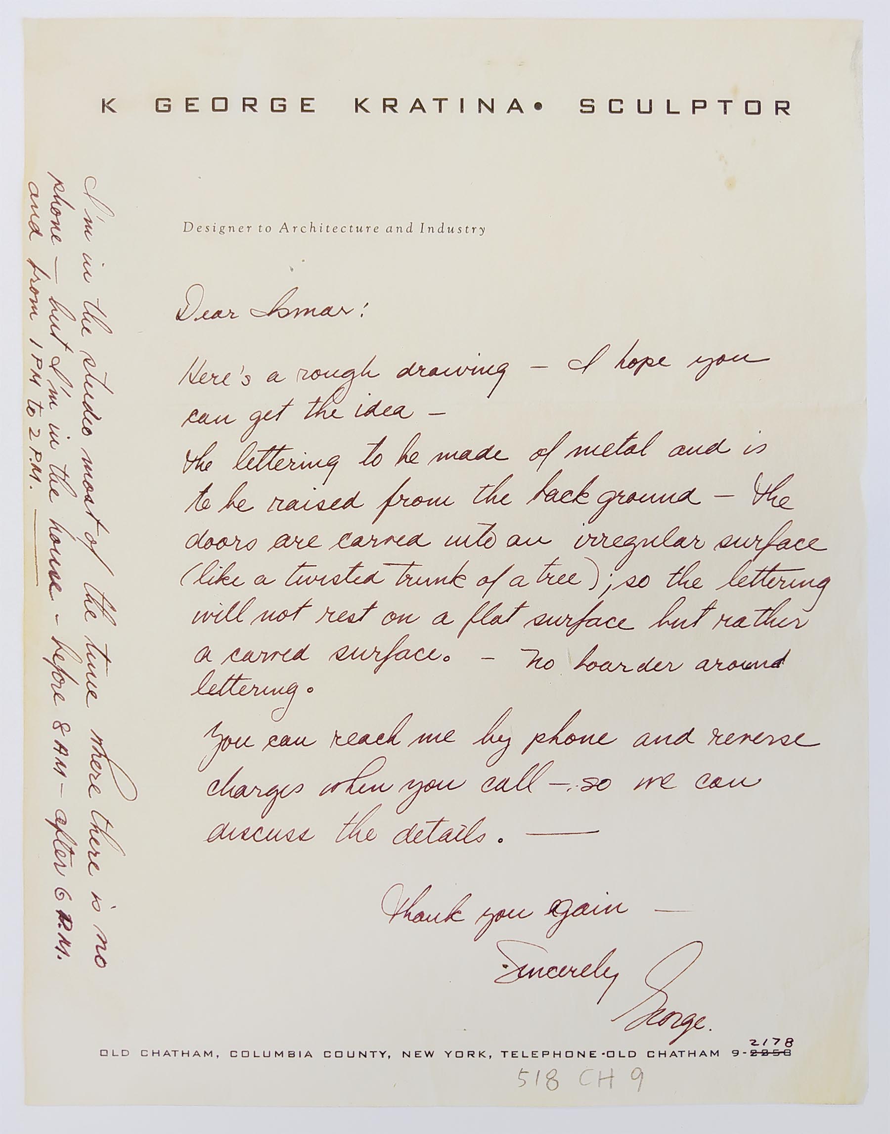
Kratina and his wife Annie had a home in Old Chatham, New York, with a studio where he did his often monumental work. In an undated letter to Ismar David, he described a potential collaboration.
Here’s a rough drawing — I hope you can get the idea—
The lettering to be made of metal and is to be raised from the background — the doors are carved into an irregular surface (like a twisted trunk of a tree); so the lettering will not rest on a flat surface but rather a carved surface. — no boarder [sic] around lettering.
You can reach me by phone and reverse charges when you call – so we can discuss the details. –
Thank you again —
Sincerely
George
I’m in the studio most of the time where there is no phone – but I’m in the house –before 8 AM – after 6 P.M. and from 1 PM to 2 P.M. —
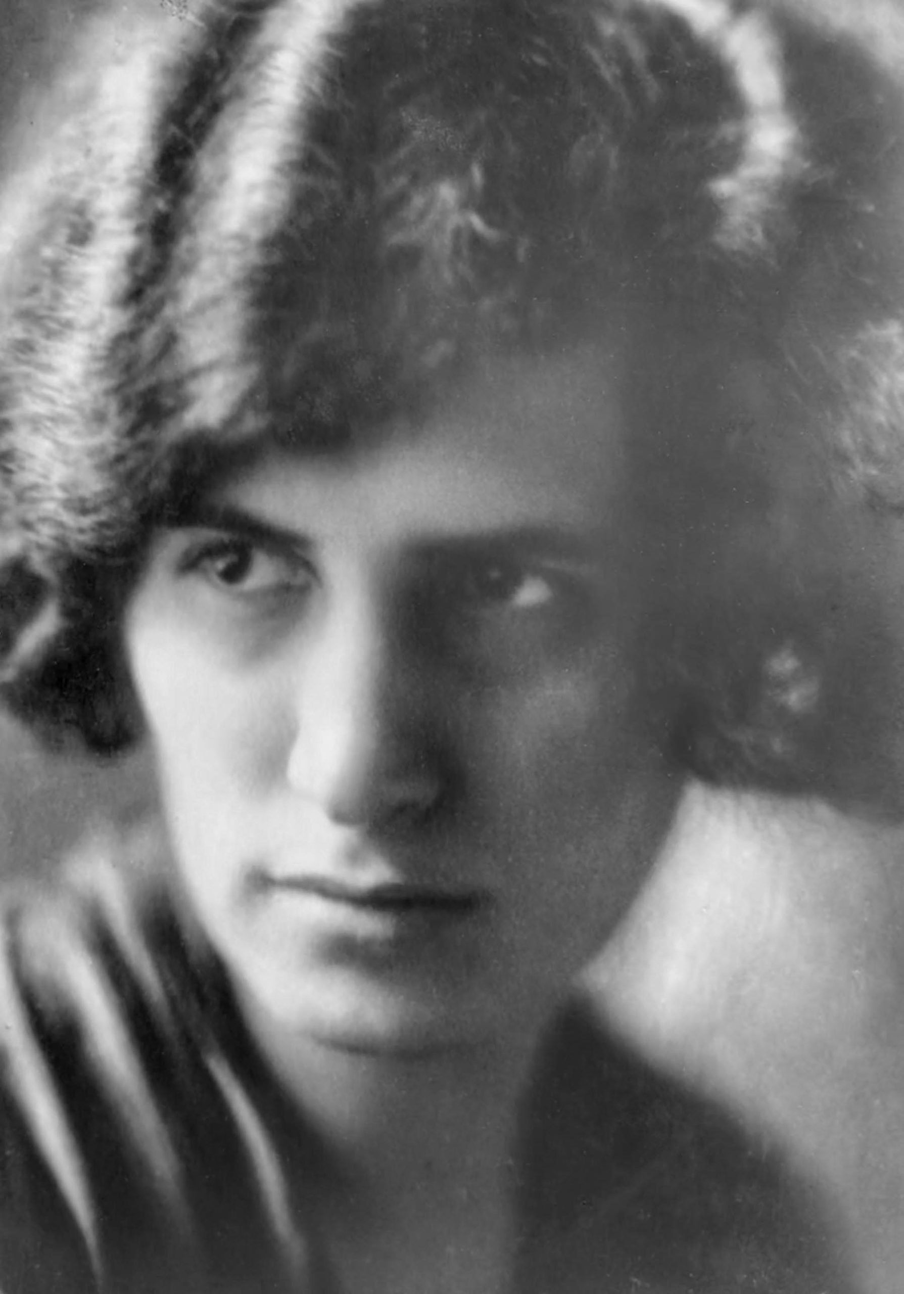
Ruth Bamberger during the 1920s, from a family album. Wikipedia.
Swiss born Ruth Bamberger grew up and attended the Art Academy in Zurich. She furthered her studies in Munich, while operating an independent textile design studio. In 1934 she immigrated to Jerusalem, where she studied with Jacob Steinhardt, Isidor Aschheim and Mordechai Ardon. By the mid 1940s, she was participating in group shows alongside Gabi Rosenthal, Jossi Stern, Elly Gross, Ludwig Wolpert, and Julie Keiner, among others. Her textile design and fresco work, like a mural in the bar of the Eden Hotel, were often praised. Bamberger taught painting and batik at the Bezalel Academy and exhibited internationally in the 1950s, 60s and 70s.
In August 1948, the Mishmar Ha’am (People’s Guard) and the Army’s Special Services sponsored a series of events called the “Week of Embattled Jerusalem.” It was “Jerusalem’s biggest week of public entertainment since the beginning of the war1Jerusalem Week, The Palestine Post, August 20, 1948, p.3. and included musical programs, dances, parades, plays and an exhibition entitled “Modern Jerusalem Handicraft” at the Bezalel Museum. Bamberg’s textile designs and wrapping papers appeared in it and Ismar David was said to dominate the applied graphic arts portion of the exhibition.2Handicrafts on Show, The Palestine Post, September 3, 1948, p.3. In October 1961, Bamberger visited New York on her way to a solo exhibition in St. Louis, Missouri. She wrote a note to Ismar David.
Ich war ziemlich betrübt, daß Gideon Ihnen die Bilder am Abend gezeigt hat. Es lag mir daran—an Ihrem Urteil. Zum Teufel! To hell with it! Es gibt so wenig Menschen, die wirklich etwas verstehn; in Jerusalem lebe ich in einem Meer von Unverstand—aber vielleicht kenne ich nicht die richtigen Menschen.
Als Tami letzten November sozusagen von einem Tag auf den anderen heiratete u. weg ging; „I felt awfully lost.“ Nun ist es herrlich mit den Kindern—aber ich halte mich sehr zurück u. bin glücklich daß ich ihnen in vielem helfen kann.
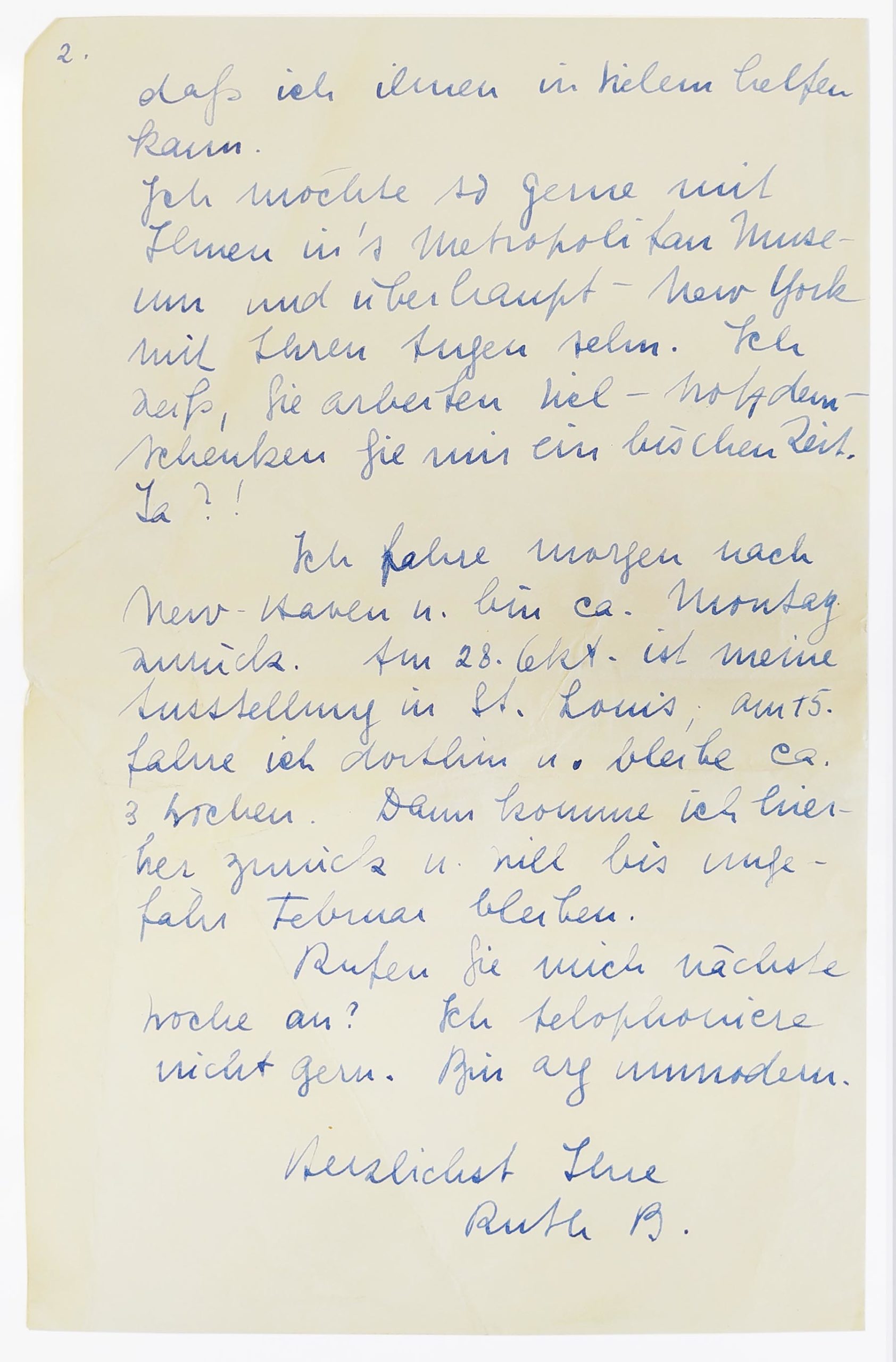
Ich möchte so gerne mit Ihnen in’s Metropolitan Museum und überhaupt – New York mit Ihren Augen sehn. Ich weiß, Sie arbeiten viel—trotzdem—schenken Sie mir ein bischen Zeit. Ja?!
Ich fahre morgen nach New Haven u. bin ca. Montag zurück. Am 28. Okt. Ist meine Ausstellung in St Louis; am 15. Fahre ich dorthin u. bleibe ca. 3 Wochen. Dann komme ich hierher zurück u. will bis ungefähr Februar bleiben. Rufen Sie mich nächste Woche an? Ich telephoniere nicht gern. Bin arg unmodern.
Herzlichst Ihre Ruth B.
Dear Ismar David
I was rather distressed that Gideon showed you the pictures this evening. I was concerned with—your opinion. The Devil with it! To hell with it! There are so few people, who really understand something, I live in a sea of ignorance in Jerusalem—but maybe I don’t know the right people.
When Tami got married last November, without warning, so to speak, and went away; “I felt awfully lost.” Now it’s marvelous with the children—but I keep myself very much in check and am happy that I can help them with a lot of things.
I would so like to go to the Metropolitan Museum with you and generally—see New York with your eyes. I know, you are very busy with work—nevertheless—you will give me a bit of time. Okay?!
I’m going to New Haven tomorrow and will be back on Monday. On October 28th is my exhibition in St. Louis; on the 15th, I travel there and stay for about 3 weeks. Then I’ll come back here and want to stay until about February. Will you call me next week? I don’t like to telephone. I am terribly old-fashioned.
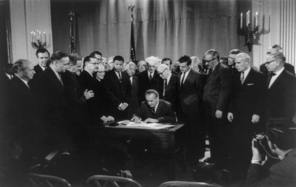
Lyndon Johnson will forever be reviled for escalating the war in Vietnam, but as far as domestic policy is concerned, he remains one of the most effective and progressive presidents in U.S. history. He used his immense political experience, forceful personality and commitment to social justice to support a sweeping vision for a more equitable nation. His War on Poverty helped lift millions of Americans above the poverty line. The Civil Rights Act of 1964 banned racial discrimination in public accommodations, interstate commerce, workplaces and housing. The Voting Rights Act of 1965 banned discriminatory practices that had disenfranchised voters in the southern states. The Immigration and Nationality Act of 1965 ended quotas based on ethnic origin. Johnson’s administration created Medicare, Medicaid, Head Start, the Jobs Corps, VISTA, the National Endowment of the Arts and National Public Radio. Nevertheless, Johnson lost the New Hampshire primary in March 1968. Facing backlash for his social policies from the right and overwhelming opposition to the war from the left, as well as increasingly poor health, he ended his campaign for a second full term and retired to his ranch in Texas.
Johnson had been out of office for four months, when a short work of fiction by Paul Edward Gray appeared in the May 17th issue of New Yorker.1Gray, Paul Edward, “My Three Weeks at the White House.”New Yorker, 17 May 1969, pp. 32-33. It was a satirical swipe at trends in contemporary art and, rather gratuitously, the former president. Johnson’s Texas drawl is mocked and he appears as something of a Philistine, but, principally, it is his iconic initials that provide the necessary driver for the plot. In the story, the President personally calls an artist, acclaimed for having painted an “electric blue Bodoni” E “on a field of fuchsia”, and asks if he can paint all of the letters, specifically L, B and J. The artist installs himself in the “Situations room” for three weeks, creating various grandiose works on canvas of each letter, only to find out in the end that a monogram (for cufflinks, bathrobes, “and letter paper and saddles and speedboats”) was wanted. To cap it off, Eric F. Goldman’s unflattering memoir, The Tragedy of Lyndon Johnson, which had appeared in January, gets a nod.
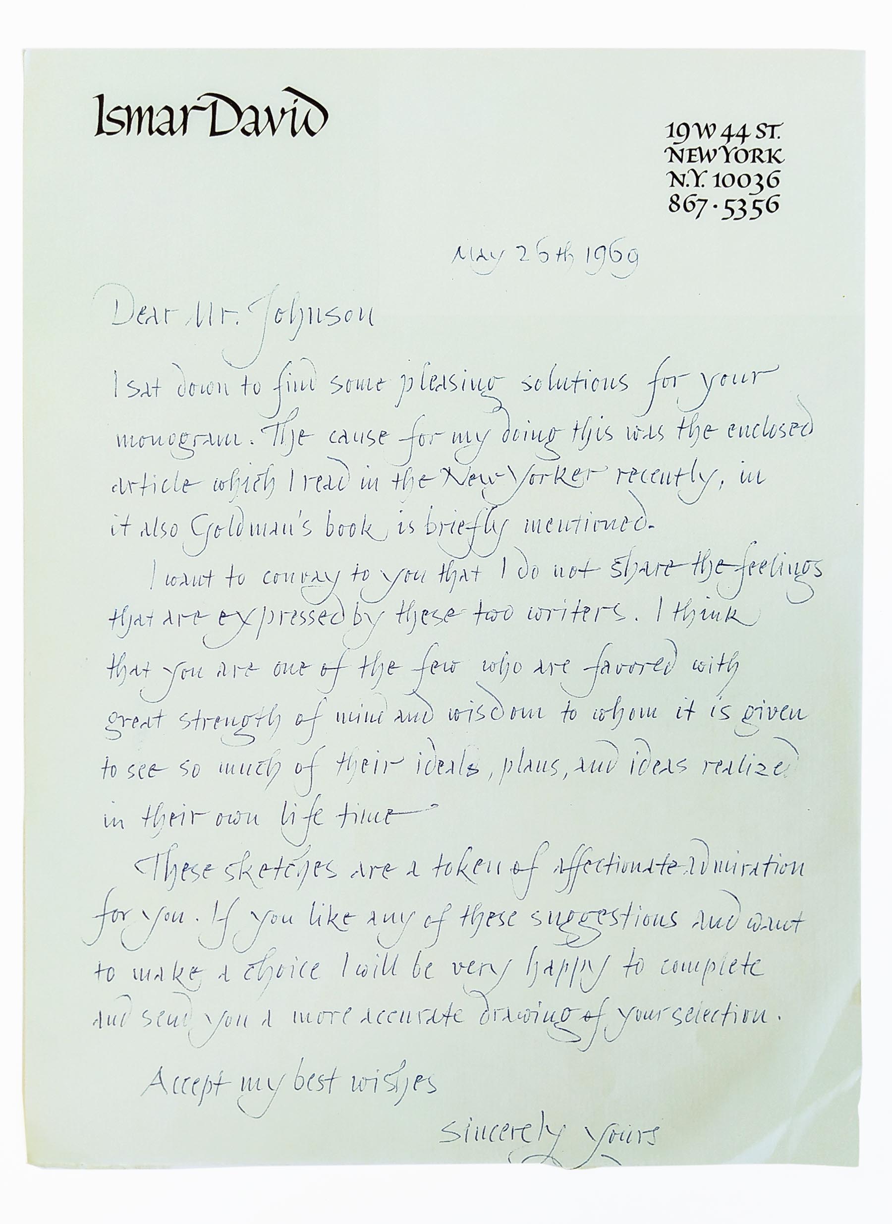
On May 26, 1969, Ismar David sent several designs to the former president, with a note.
I sat down to find some pleasing solutions for your monogram. The cause for my doing this was the enclosed article which I read in the New Yorker recently, in it also Goldman’s book is briefly mentioned.
I want to convey to you that I do not share the feelings that are expressed by these two writers. I think that you are one of the few who are favored with great strength of mind and wisdom to whom it is given to see so much of their ideals, plans, and ideas realized in their own lifetime.
These sketches are a token of affectionate admiration for you. If you like any of these suggestions and want to make a choice, I will be very happy to complete and send you a more accurate drawing of your selection.
Accept my best wishes Sincerely yours
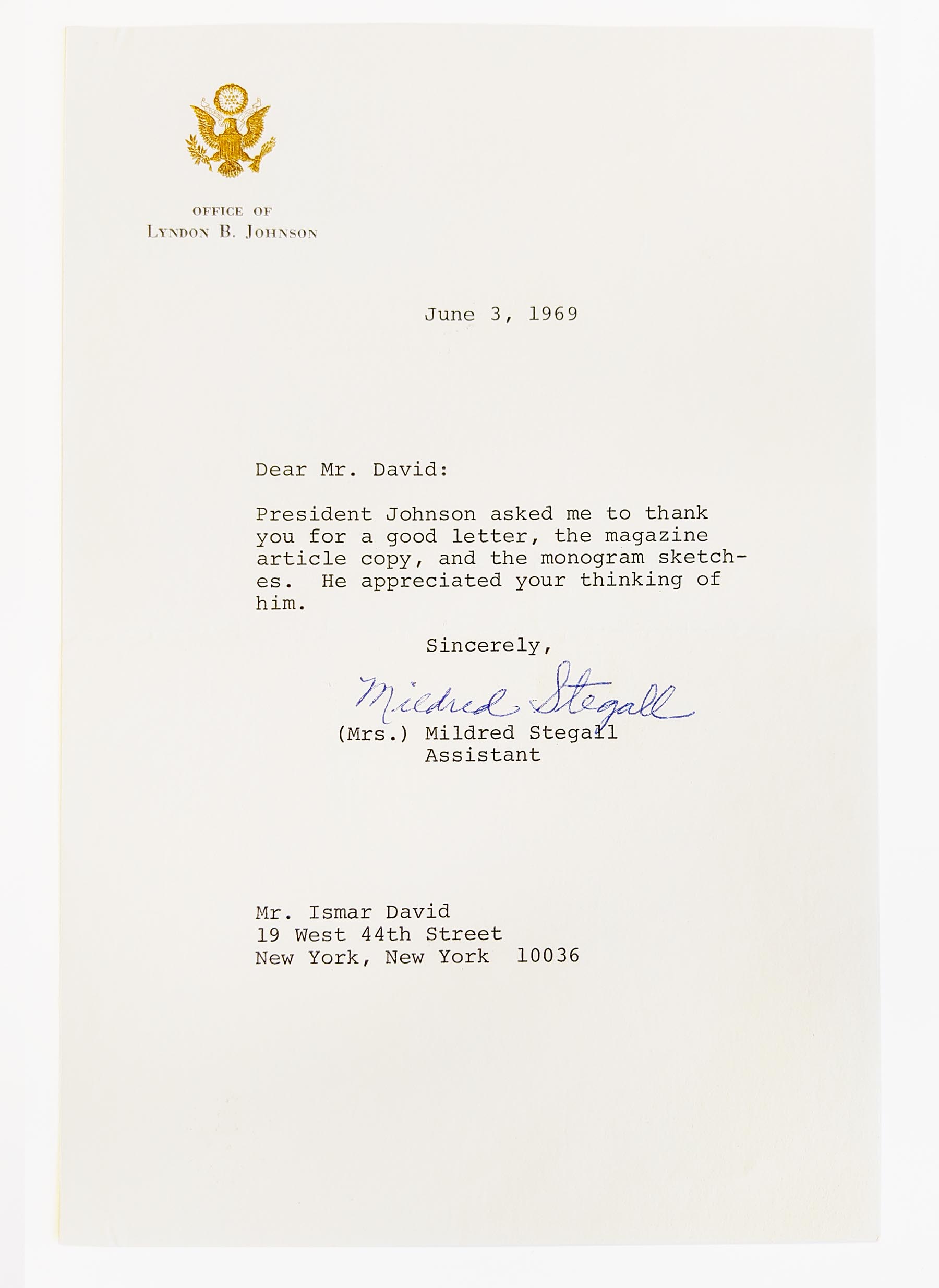
Johnson’s secretary responded on June 3.
Dear Mr. David:
President Johnson asked me to thank you for a good letter, the magazine article copy, and the monogram sketches. He appreciated your thinking of him.
Ludwig Wolpert was born in a village near Heidelberg to a family that was poor in financial resources but rich in Jewish tradition. His deeply religious, almost mystical, father would remain a profound influence on Wolpert’s life and the sensitivity with which he handled Jewish themes in his work.1Briggs, Kenneth A. Museum Show Honors Wolpert. New York: The New York Times, July 4, 1976, p. 34.
In 1916, Wolpert received a scholarship from the Gesellschaft zur Förderung des Handwerks unter den Juden (Society for the Advancement of Handicrafts among Jews) to study at Frankfurt am Main’s Kunstgewerbeschule (School of Applied Arts).2Kanof, Abram, Jewish Ceremonial Art and Religious Observance. New York: Harry N. Abrams, Inc., 1970, p.35. He studied there until 1920. After a few years working on his own as an independent sculptor, Wolpert returned to the Kunstgewerbeschule to study metalsmithing under Bauhaus designer Christian Dell and silversmith Leo Horovitz, who had his own workshop with his brother, mainly producing ceremonial objects for synagogues. Working in the brothers’ workshop, Wolpert found his calling. He decided to dedicate himself to making traditional Jewish ceremonial objects in a modern style. His work received its first significant exposure at the Berlin exhibition, Kult und Form (Ritual and Form), in 1931. Emmy Roth was among the group of Protestant, Catholic and Jewish artists represented.3Pleß, Will, Neuzeitliche Jüdische Kultgeräte, Menorah, 9 (1931), Heft 3–4, p. 149-50.
With the rise of Nazism, Wolpert immigrated to Palestine in 1933. In 1935, he began teaching at the Bezalel Academy in Jerusalem and co-headed the metal department. At the same time, he pursued his own work in the Bezalel workshop and is credited with bringing modern design concepts of simplified forms and sleek lines, often featuring Hebrew letters and inscriptions, to Judaica. His work came to the attention of Americans when his silver torah ornaments4Jewish Palestine Pavilion Catalogue, Exhibition and Sale, September 27-October 27, 1940. Printed by the Siebel Company, New York were displayed at the Palestine Pavilion in the 1939 World’s Fair. In 1942, he established his own workshop in Jerusalem.5Wikipedia entry for Ludwig Wolpert Then, in 1956, after helping to educate two generations of craftsmen in Israel, Wolpert accepted the invitation of Abraham Kanof and Stephen Kayser to come to New York. Together, they established the Tobe Pascher Workshop at the Jewish Museum, where Wolpert continued to teach and create for the rest of his life.
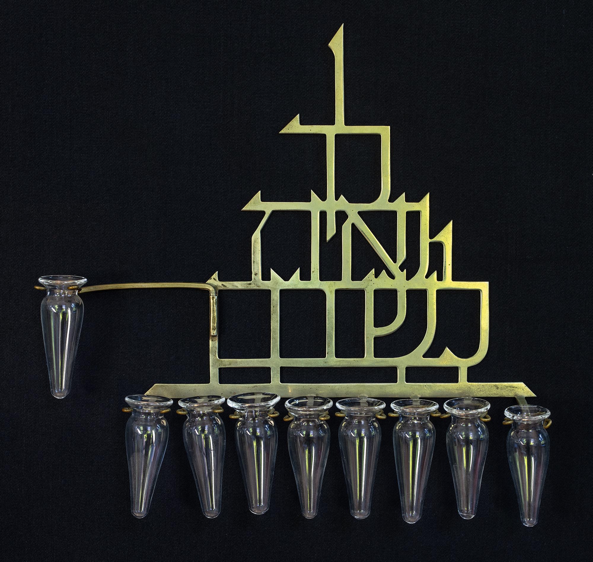
A menorah designed by Ludwig Y. Wolpert, 1953. “To praise thee is a delight.”
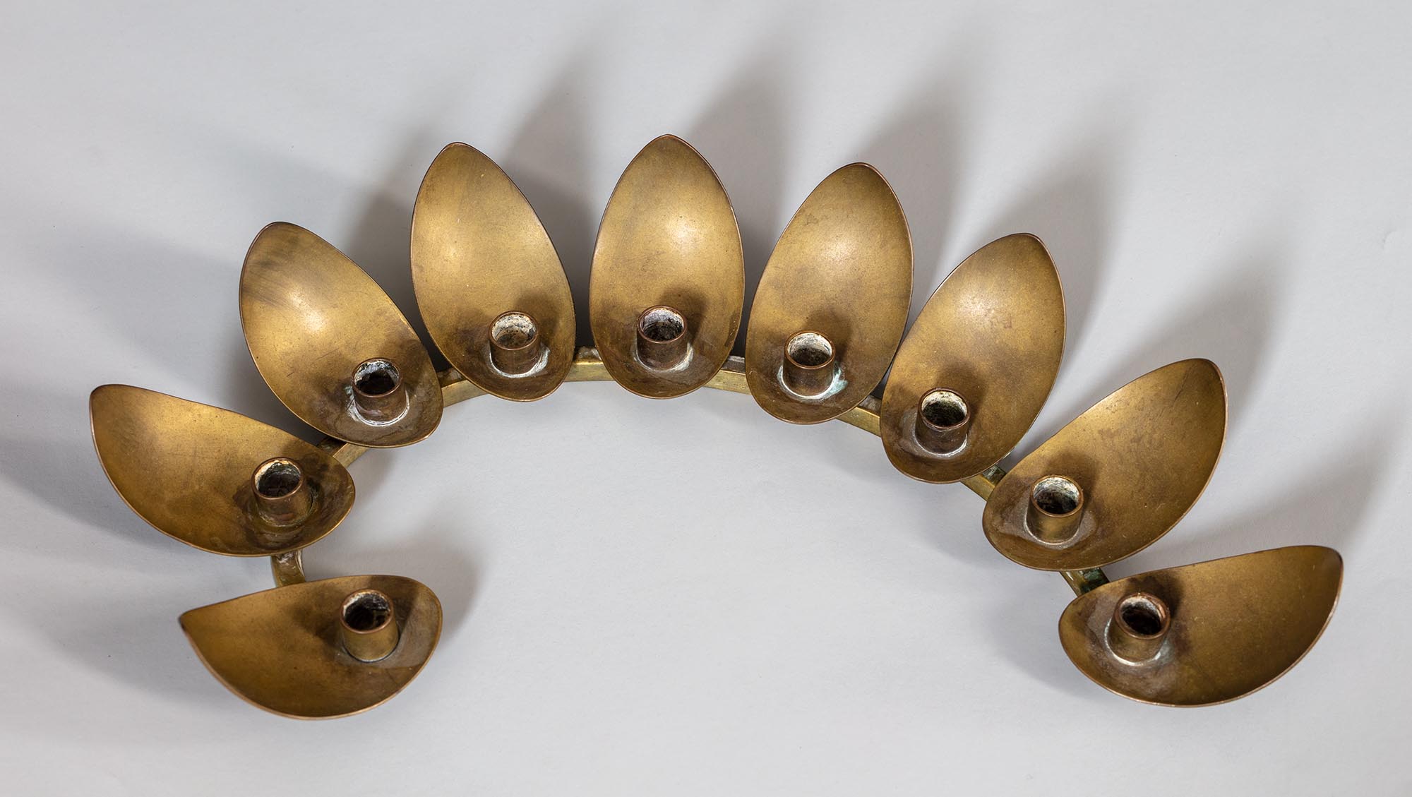
A menorah designed by Ludwig Y. Wolpert.
Ludwig Wolpert (listed as “Jehuda Wolpert, Jerusalem (Religious articles) Distributed by M. Streesover, 11 Essex St., New York City”) was one of the exhibitors in the Israel Exposition for the Bonds of Israel in New York. On May 14, 1953, Ismar David wrote to Henry Montor, Vice President of the American Financial and Development Corporation for Israel.
To: Mr. Henry Montor Bonds for Israel 120 Broadway, NY
From: Ismar David 130 West 46th Street Room 401, NY
Subject: Wrought-Iron Menorah designed by Y. Wolpert
In accordance with telephone conversations held with your office, I would like to urge that consideration be given to the request made by Mr. Yehuda Wolpert of Jerusalem and Dr. Kayser of the Jewish Museum for the loan of the wrought-iron menorah now held at the Exposition.
I have known Mr. Wolpert in Jerusalem for many years and have also know of his having designed this particular menorah. Later, collaborating with a Mr. Sigman, he had it made at the Sigman Workshop.
Furthermore, at the time of the arrival of the exhibits in New York I remember distinctly seeing a card attached to the menorah which indicated that it had arrived from the Sigman Workshop and listed the name of Mr. Wolpert as the designer. This card was lost at the Exposition.
Since I know Mr. Wolpert to be one of the very few exhibitors who generously lent his valuable menorah free of charge, and who tried to cooperate with us in every respect, I would be very grateful if you would authorize the release of this menorah for the short period of the exhibit at the Jewish Museum.
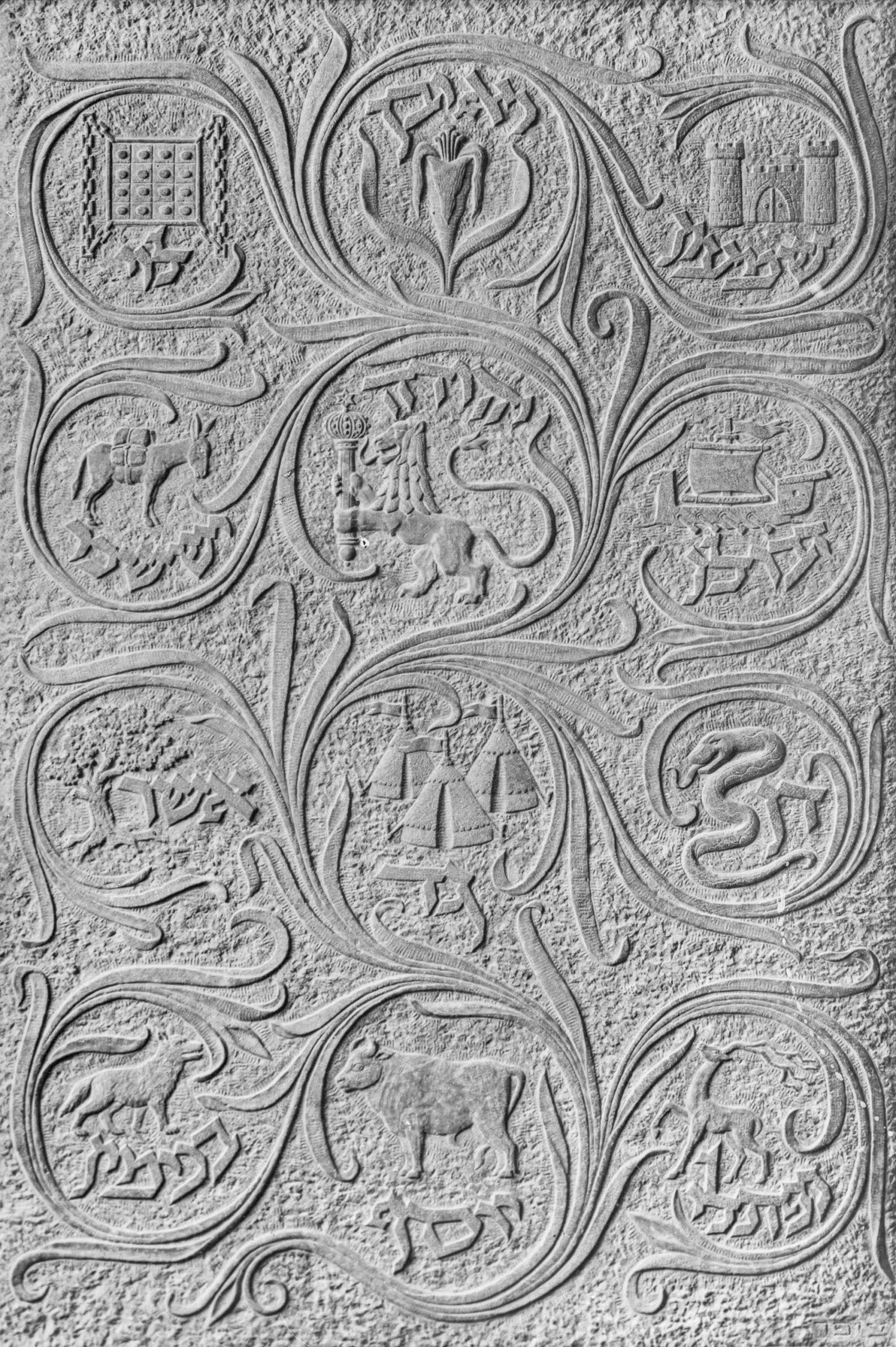
Emotional expression and simplicity, key principles of Viennese sculptor and pedagogue Eugen Steinhof’s philosophy, characterize Moshe Ziffer’s early work. Steinhof encouraged his students to ignore small details to concentrate on the greater play of light on form.1Ballas, Gila, Moshe Ziffer The Man and the Artist, Research and Publications Archive, The David and Yolanda Katz Faculty of the Arts, Tel Aviv University. His student Moshe Ziffer’s many female nude studies, often compared to Maillol’s, eschew academic anatomical detail in favor of unfussy form and line. His sculpture, The Pioneer, for the Palestine Pavilion at the 1939 World’s Fair demonstrates this as well. These and smaller public works, including the gravestone for Chaim Bialik (in collaboration with the painter Moshe Mokdi in 1935), the monument for the controversial re-interment of Ber Borochov and his wife in Kinneret Cemetery (in collaboration with Aryeh Sharon)2The Unveiling Ceremony of Borochov’s Grave…, Mishmar-The Guard, November 9, 1964. Tel Aviv, p. 7. and the Weizmann gravestone were comprised of bold forms, without ornamentation, except, in some cases, a figurative image of some kind.
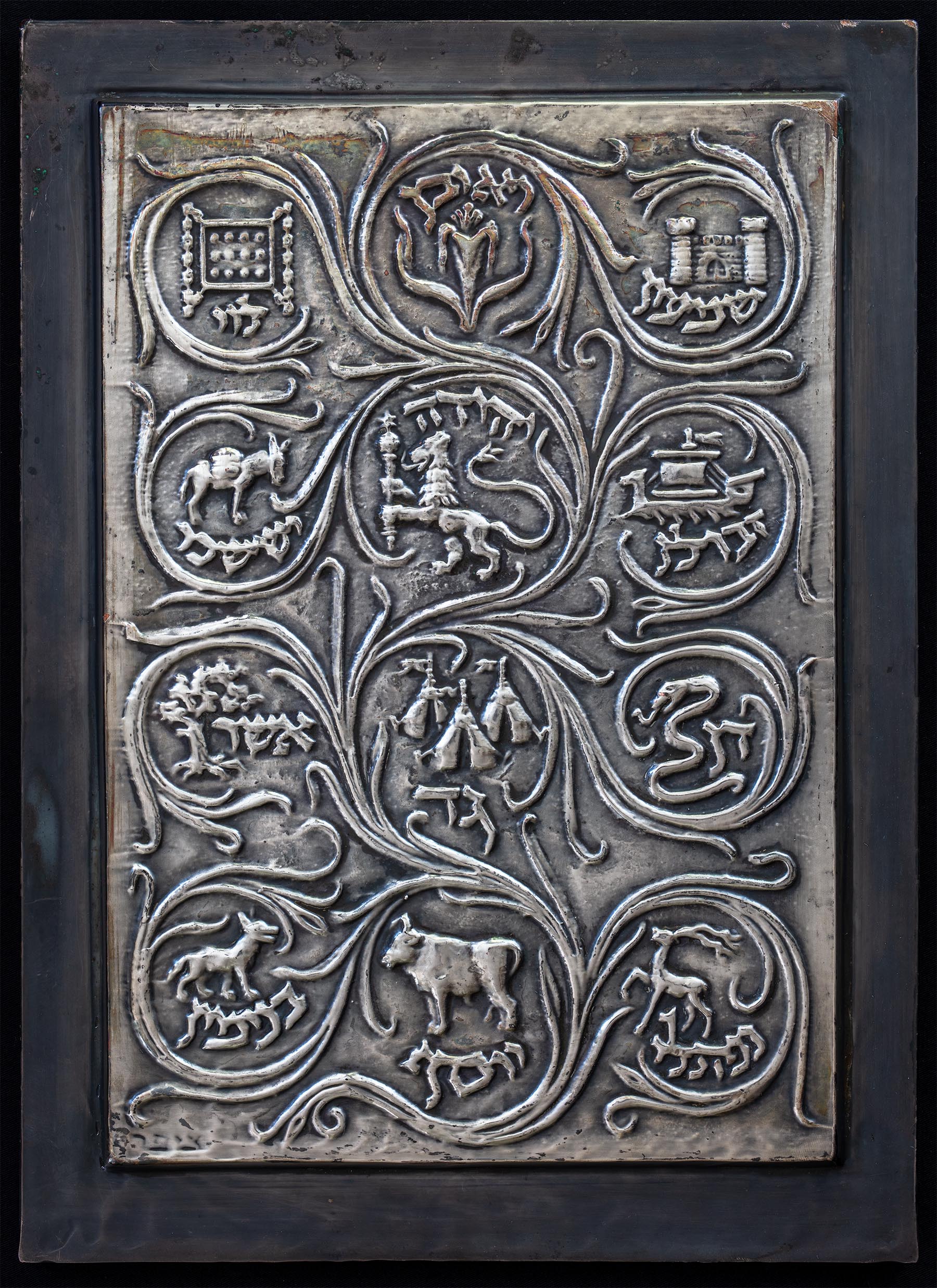
A gypsum bas relief of the Twelve Tribes of Israel.
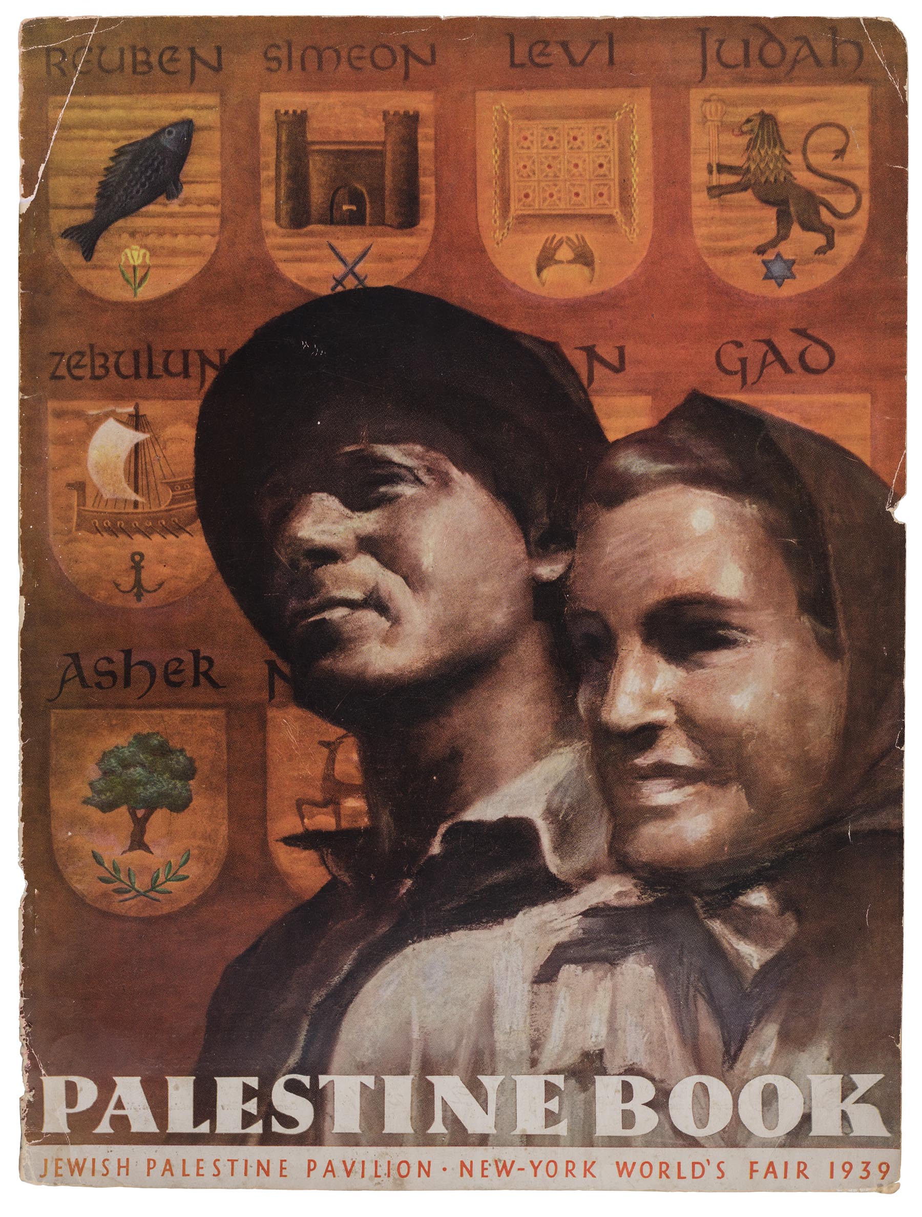
A large panel of the twelve tribes of Israel, signed by and attributed to Moshe Ziffer, stands out in contrast. A photograph of it, probably taken by Israel Zafrir, was among Ismar David’s papers. Although carved in stone, the ornamental scrollwork and the particular quality of the Sephardic lettering are characteristic of David’s work at the time. Indeed, the symbols are very similar to those on The Palestine Book, produced for the Palestine Pavilion in 1939.
Cover of a souvenir magazine for the Israel Pavilion at the 1939 World’s Fair.
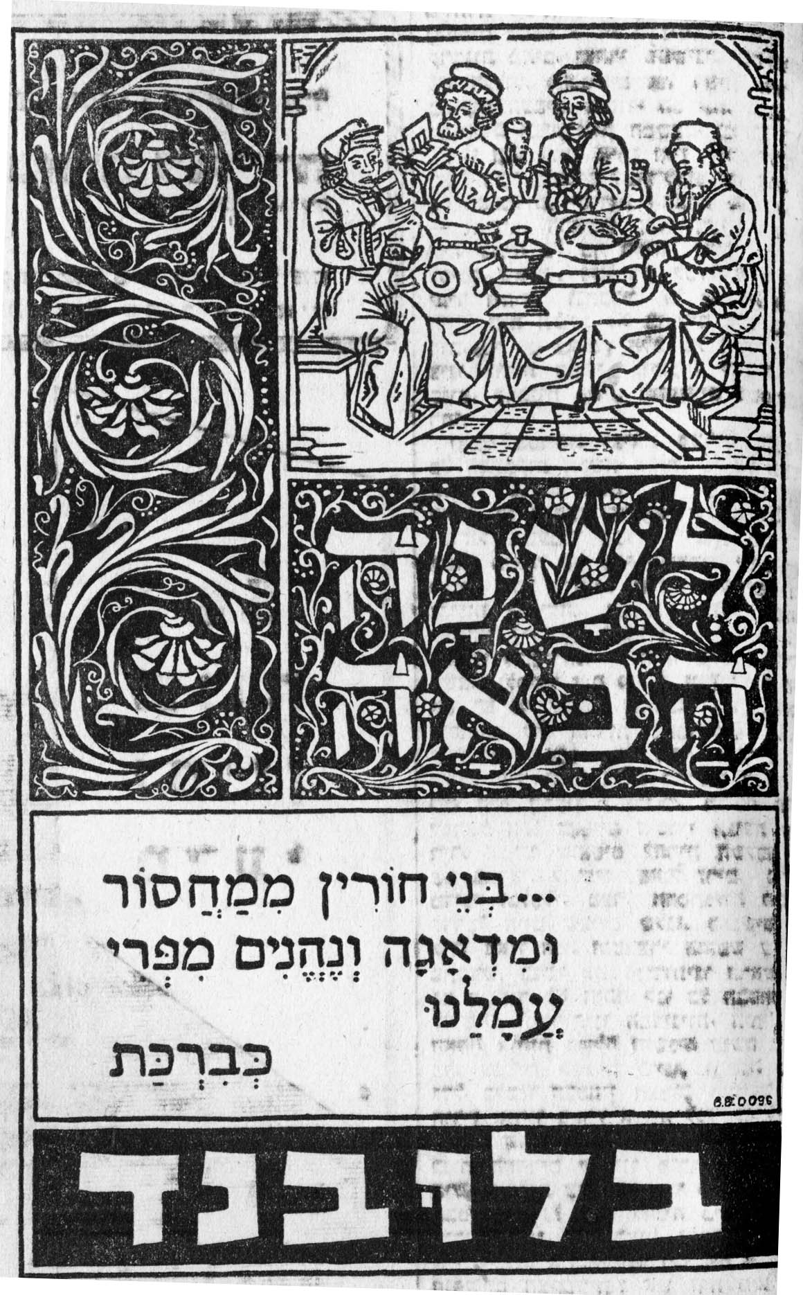
Pastiche of a medieval manuscript in a Passover advertisement for Blue Band margarine in the April 4, 1947 issue of Davar.
None of these details resemble the work, up to that point or later, of Moshe Ziffer and it seems likely that a collaboration of some kind took place. Quite a lot of the work David produced in Jerusalem was executed by others: sign painters and other craftsmen for exhibitions or commercial signage—the carved wooden cover of the Jewish National Fund’s eighth Golden Book is another example—and he must have been accustomed to other people interpreting his designs. The staff of the Sieff Institute gave this gypsum panel to Chaim Weizmann on the eve of his inauguration as the President of Israel3As described on the Weizmann Institute web site: The Collection, Weizmann Wonder Wander in 1949. The Israel Museum dates it, however, as 1940/41. Today, it remains installed on a wall of Weizmann’s home in Rehovot. The design has enjoyed a much wider audience, though, if in ever decreasing size and quality, in many smaller metallic iterations.
Silver plated copy of a bas-relief of the twelve tribes of Israel. 23.2 x 32 cm.
The son of a self-taught master builder, Moshe Ziffer was born in Przemyśl in Galicia. He began to learn Hebrew at the age of six, imbibed a spirit of Zionism at home and was a member of the Socialist-Zionist youth group, Hashomer Hatzair. He had the benefits of a secular education that would have prepared him for university studies,1Ballas, Gila, Moshe Ziffer The Man and the Artist, Research and Publications Archive, The David and Yolanda Katz Faculty of the Arts, Tel Aviv University. but instead trained with HeHalutz (The Pioneer), as a carpenter,2Wikipedia entry for Moshe Ziffer. and joined the great wave of migration to Palestine in 1919. In the old new land, he took part in a number of large scale projects which included planting 5,000 eucalyptus trees in Qastina and building the Haifa-Gedda Road. When an accident with a contentious donkey landed him bedridden in a hospital for an extended time, he came across Dmitry Merzhkovsky’s vivid novel about Leonardo da Vinci. The young laborer had hardly read 20 pages before he knew he must become a sculptor.3The Sculpture Garden of Moshe Ziffer, Maariv, October 7, 1977, p. 23. He became fascinated with “the fantastic shapes of olive tree roots” and began imitating them in wood carvings of his own. 4 Peczenik, Hermann, Der Bildhauer Moscheh Ziffer, Menorah: jüdisches Familenblatt für Wissenschaft, Kunst und Literature, vol. 6, 1928, issue 11-12, November 1928, p. 647. In October 1924, he was given a small stipend to seek further treatment in Vienna. He took the opportunity to visit his family and apply for a place in the class of Eugen Gustav Steinhof, director of the Universität für angewandte Kunst. Steinhof recalled:
Herr Ziffer kam zu mir mit einer geschnitzten Baumwurzel in der Hand und mit der Absicht, in meine Bildhauerklasse einzutreten. Er sagte mir ferner, daß er Gärtner gewesen wäre. Die ruhige Tiefe seiner blauen Augen, die feine Linie seines Mundes sowie der Ernst und die Ruhe seiner Rede bewogen mich, ihn als Schüler aufzunehmen und nicht seine geschnitzte Baumwurzel. Wer kann den Wert einer menschlichen Seele in ihrer Tiefe ermessen, wenn Reinheit und Scheu sie verhüllt?5Under the rubric Kleine Chronik, Neue Freie Presse Abendblatt. Vienna: November 2, 1928, p. 1.
Mr. Ziffer came to me with a carved tree root in his hand and with the intention of entering my sculpture class. Further, he told me that he had been a gardener. The quiet depths of his blue eyes, the delicate line of his mouth, as well as the seriousness and stillness of his discourse, and not his carved tree root, moved me to take him as a student. Who can measure the depth of a human soul, if purity and reserve veils them?
Through the sponsorship and encouragement of Steinhof and of Chief Rabbi of Vienna Peretz Hayut, Ziffer remained in Austria’s capital for almost three years. In 1928, the Holbein Gallery exhibited 23 of his works in an array of media: marble, stone, alabaster and terracotta. Despite the success of the exhibition, or perhaps because of it—the reviewer in Der Tag found fault with his work, but also pronounced him “on a good path”6Kollektivaustellung M. Ziffer, Der Tag October 20, 1928, p. 7. ; the Neue Freie Presse predicted a bright future if he would acquire technical more technical prowess7Under the rubric Ibid.Neue Freie Presse Abendblatt. —Ziffer left to further his studies in Berlin with Edwin Scharff. Albert Einstein befriended Ziffer in 1929 and thereafter supported Ziffer’s Berlin studies financially. In April 1933, Ziffer was forced to abandon the sculptures he had made in Berlin, as well as a promised exhibition at the Gurlitt Gallery, and returned to Palestine to devote himself to his work and to teaching. In 1937, he traveled to Paris, where his work was critically well-received and he became friendly with many in the artistic community, returning to Jerusalem in 1939. Subsequently, he divided his time between Tel Aviv and Safed.8Wikipedia entry for Moshe Ziffer.
Ziffer enjoyed considerable success in his adopted homeland. In 1935, he and the painter Moshe Mokdi won a competition to design the gravestone for Chaim Nahman Bialik. Ziffer’s larger-than-life sculpture, The Pioneer, stood in the Hall of Transformation in the Palestine Pavilion (in front of a photographic mural with lettering probably designed by Ismar David) at the 1939 World’s Fair. Ziffer’s many monumental public works dot Israel today (Weizmann Institute, the Hebrew University, the Haifa Technion, Kibbutz Hulda, Netanya, Kibbutz Netzarim, Ain Gedi), culminating in the decades-long development of his garden in Safed, by which time his work had turned fully to abstraction.
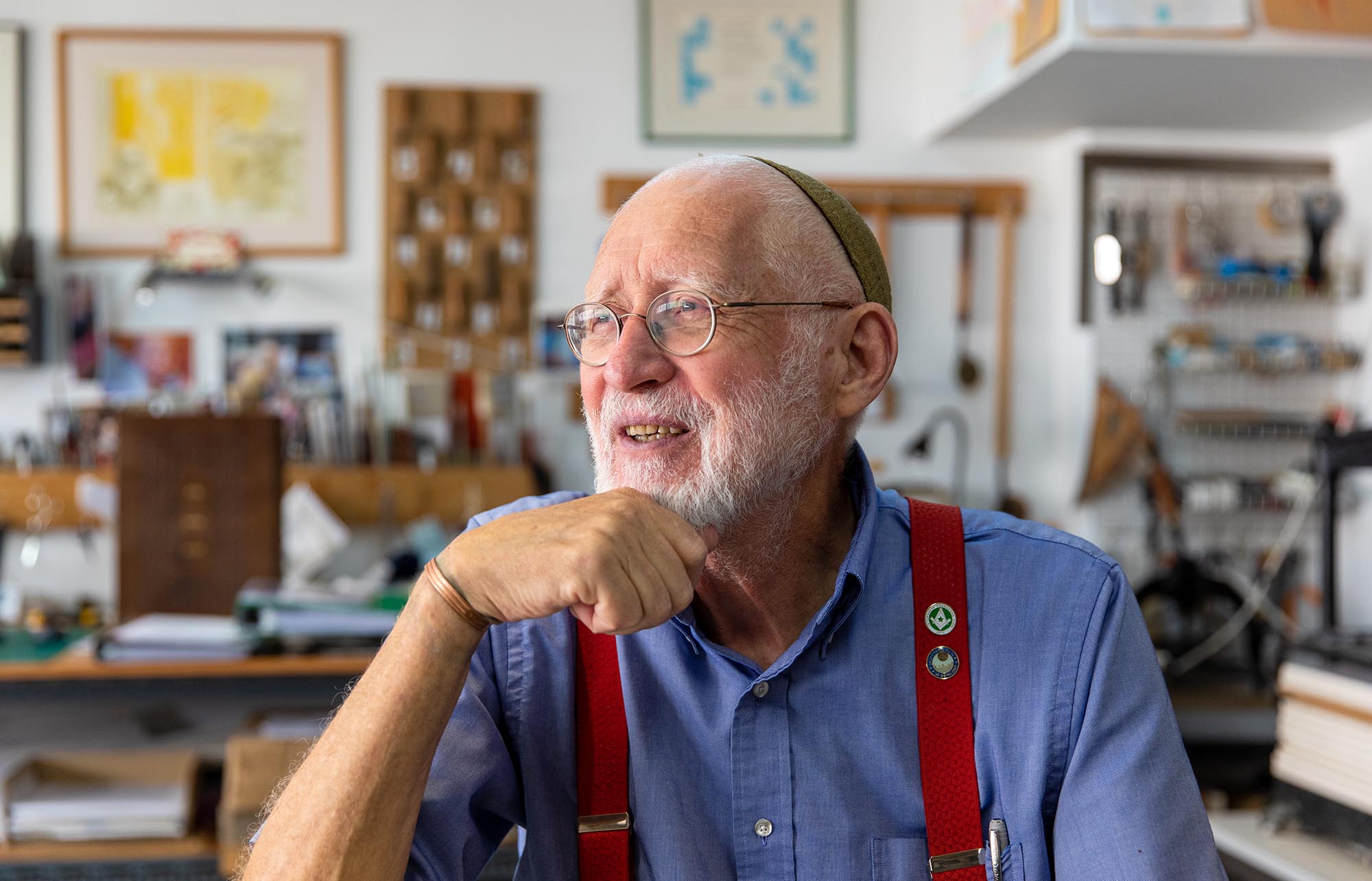
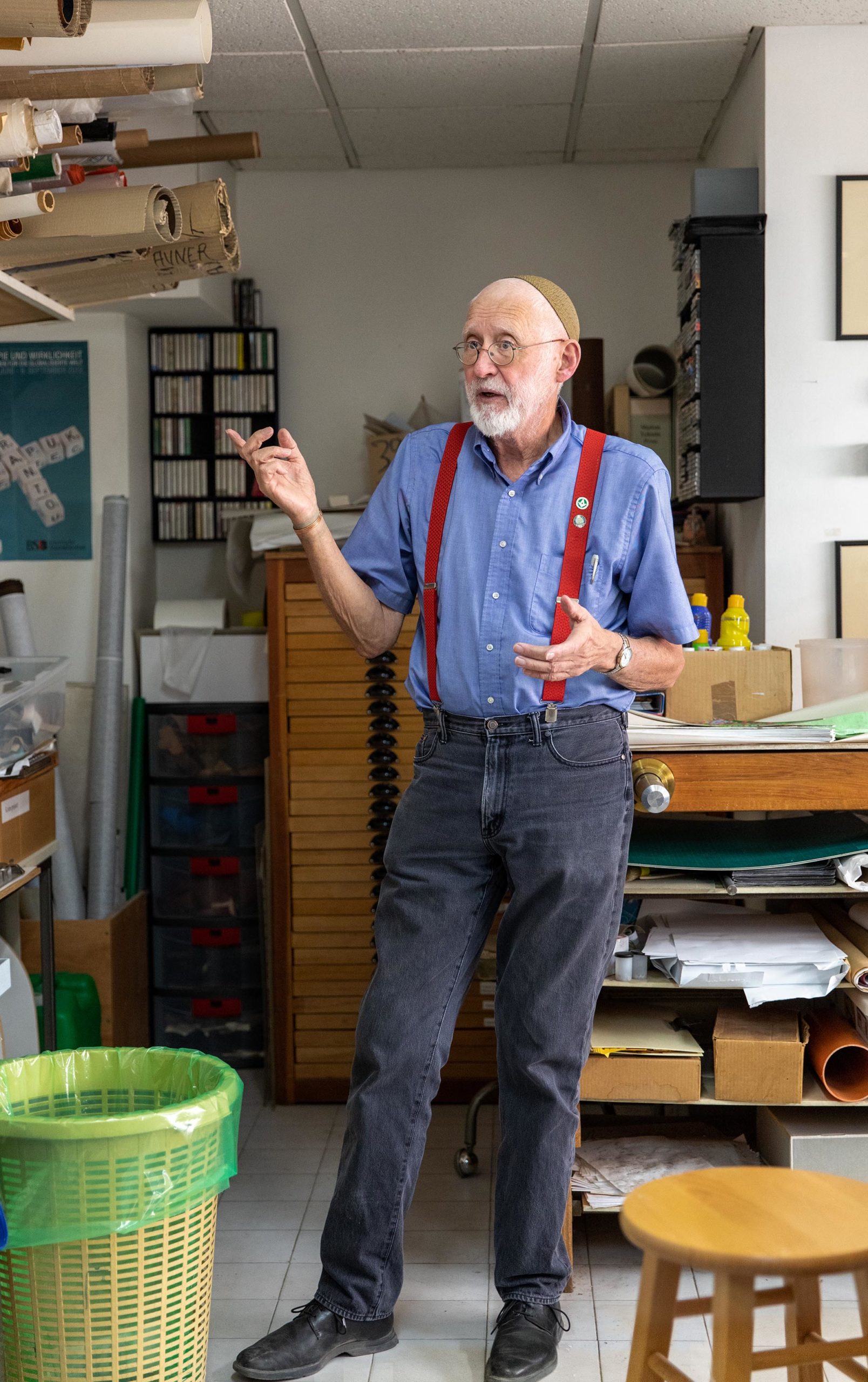
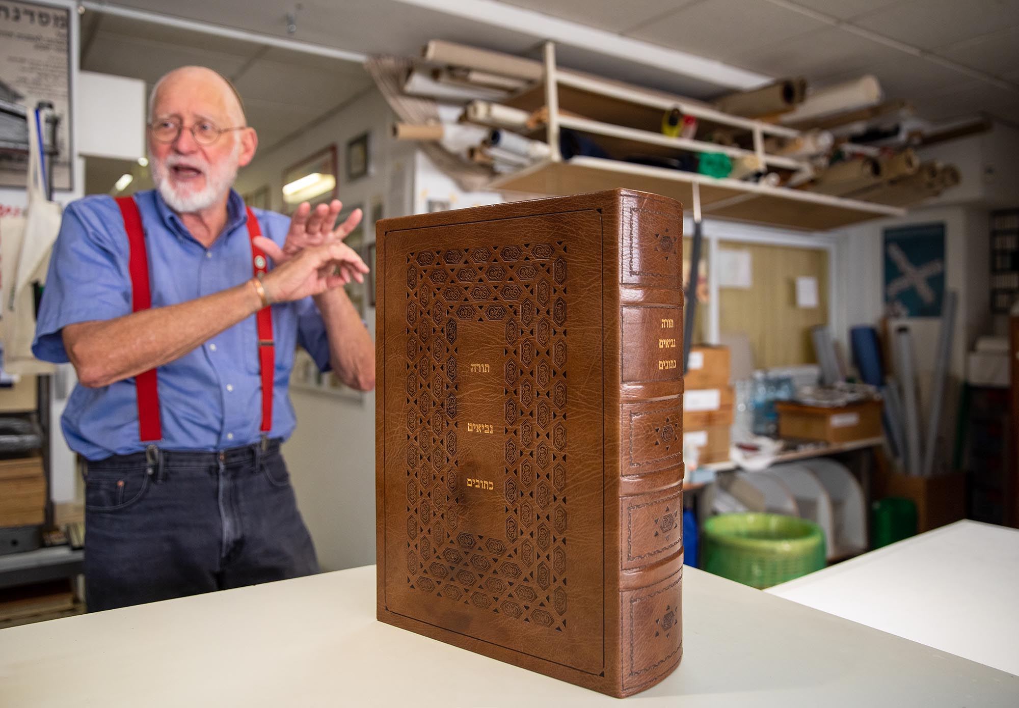
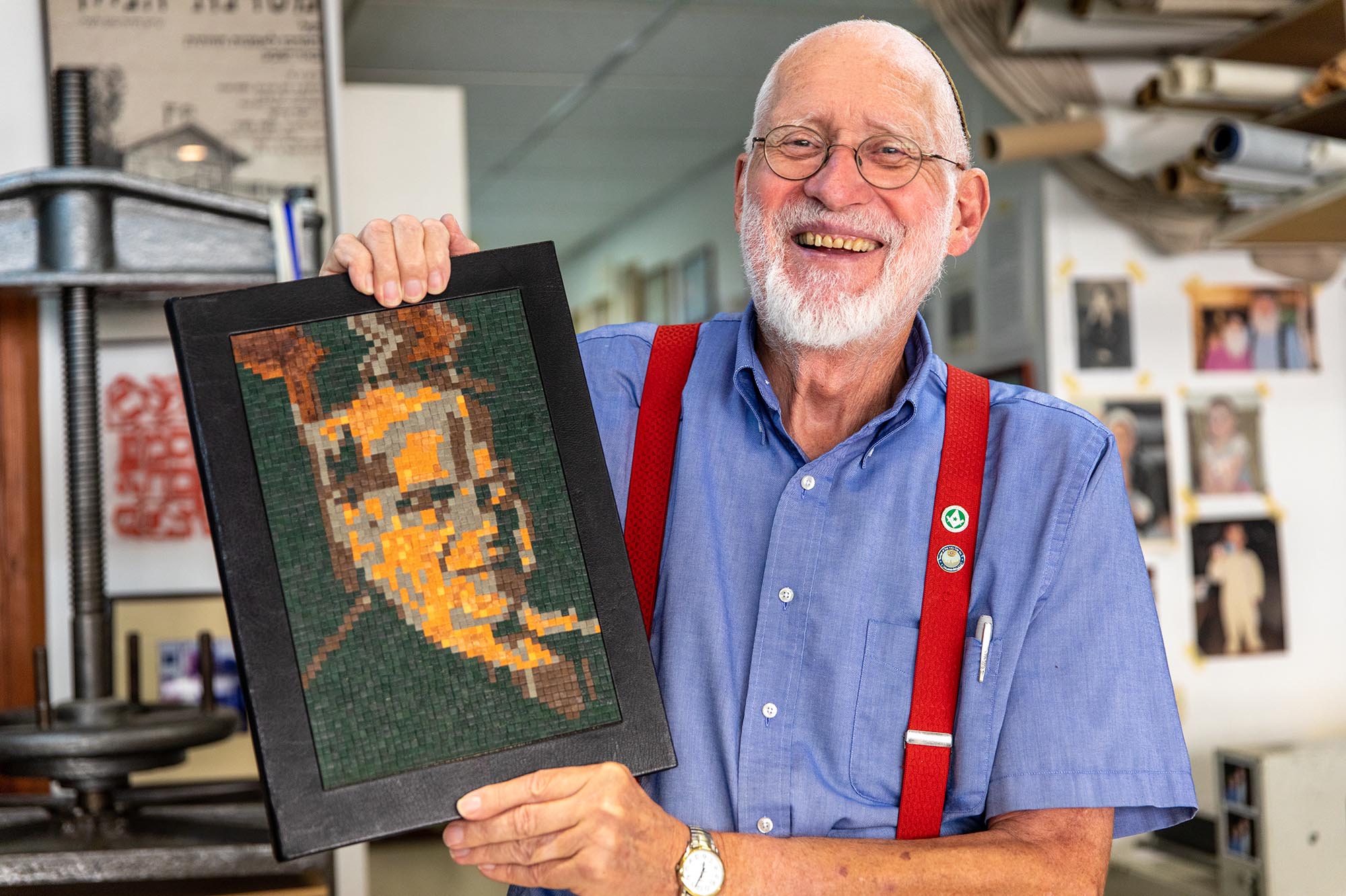
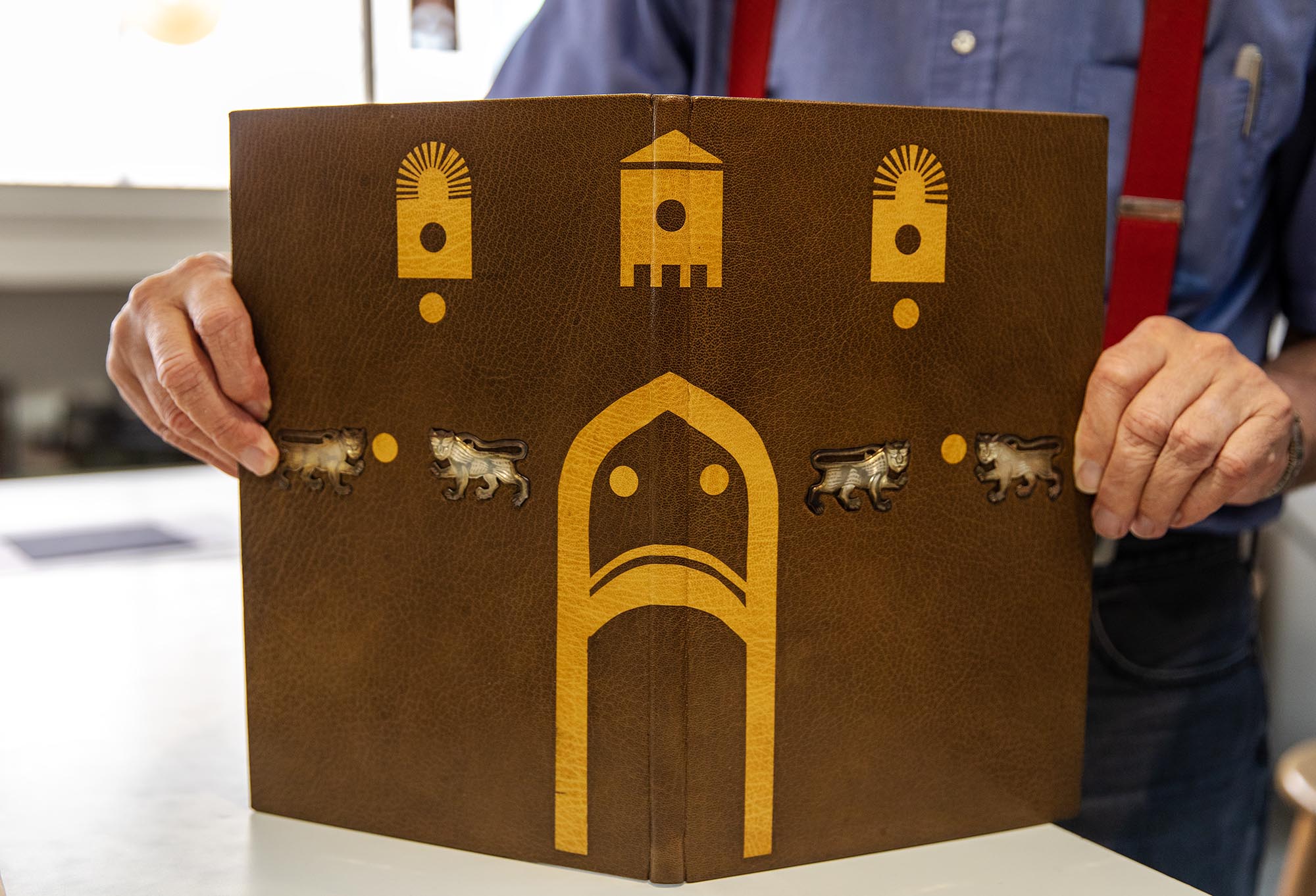
Yehuda Miklaf, born 1942, Esperanto advocate, Freemason, bookbinder and letterpress printer.
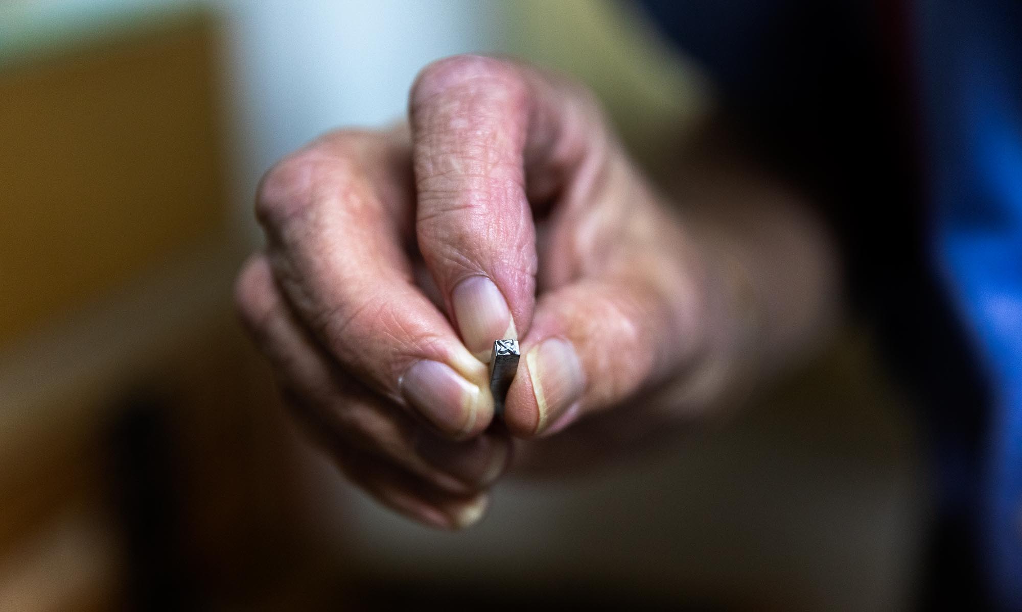
Yehuda Miklaf in his studio in Jerusalem, holding a sort (aleph) from David Hebrew, 2019.
Joyous, enthusiastic Yehuda Miklaf hails from tiny, but historic, Annapolis Royal in Nova Scotia. His gravity-defying life path took him from Canada to a Franciscan seminary in New York City to, after converting to Judaism, his own bookbinding studio in Jerusalem. He has made bindings for the Pope, an American President, a French President and the Queen of England, among others. As his wife says, “Doors don’t open for Yehuda, they fall off their hinges.”1Yehuda Miklaf in an interview with Zachy Farber-Hennessey for Israel Underground.
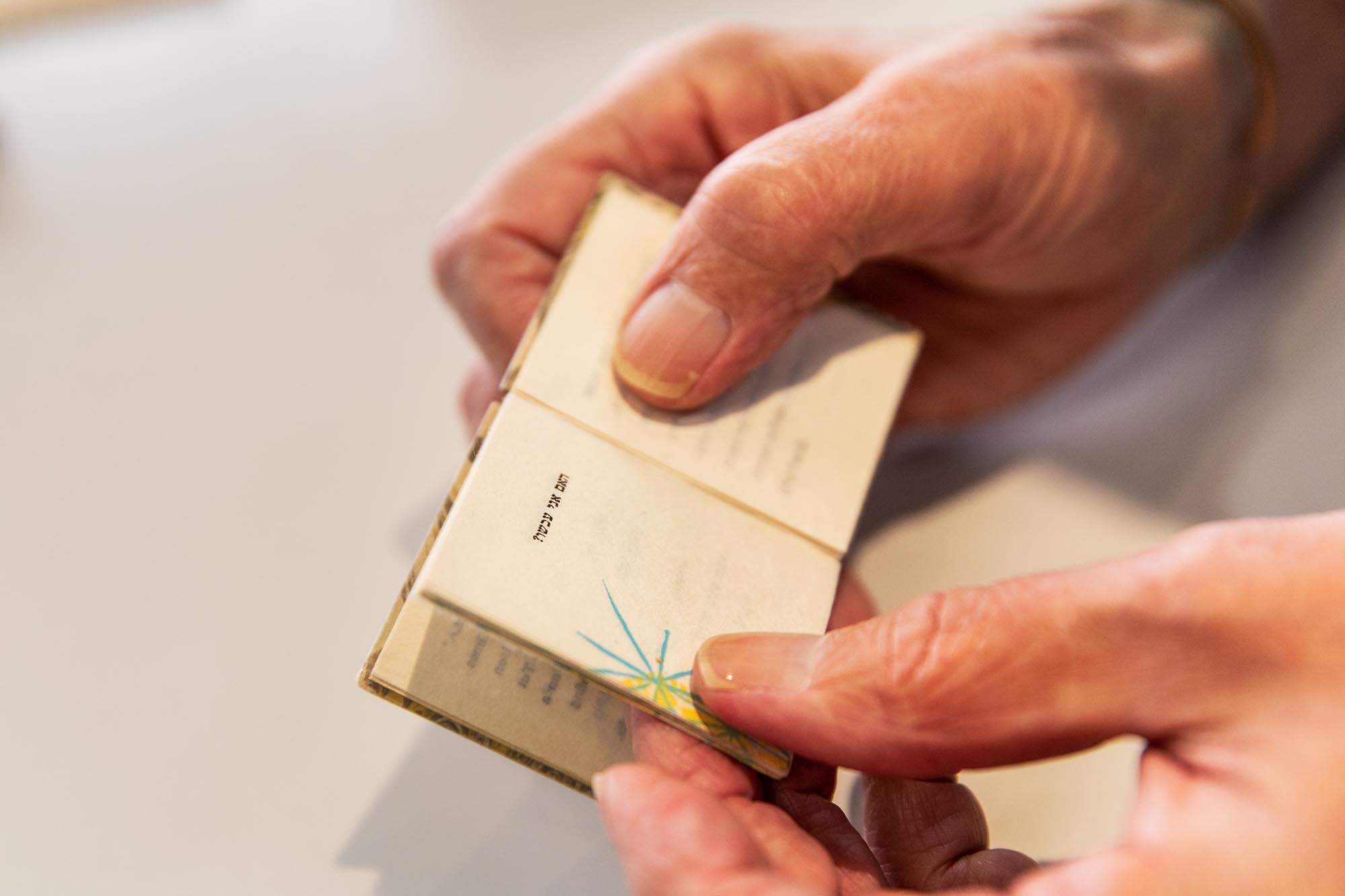
In the late eighties, fine printing began to absorb more of Miklaf’s attention and he established his own Shalom Yehuda Press with a small platen press and a Vandercook SP-15. Lili Wronker gave him the David Hebrew metal type that had been cast for Liber Librorum. In December of 1990, he wrote to Ismar David to inquire about the provenance of some Hebrew metal type.
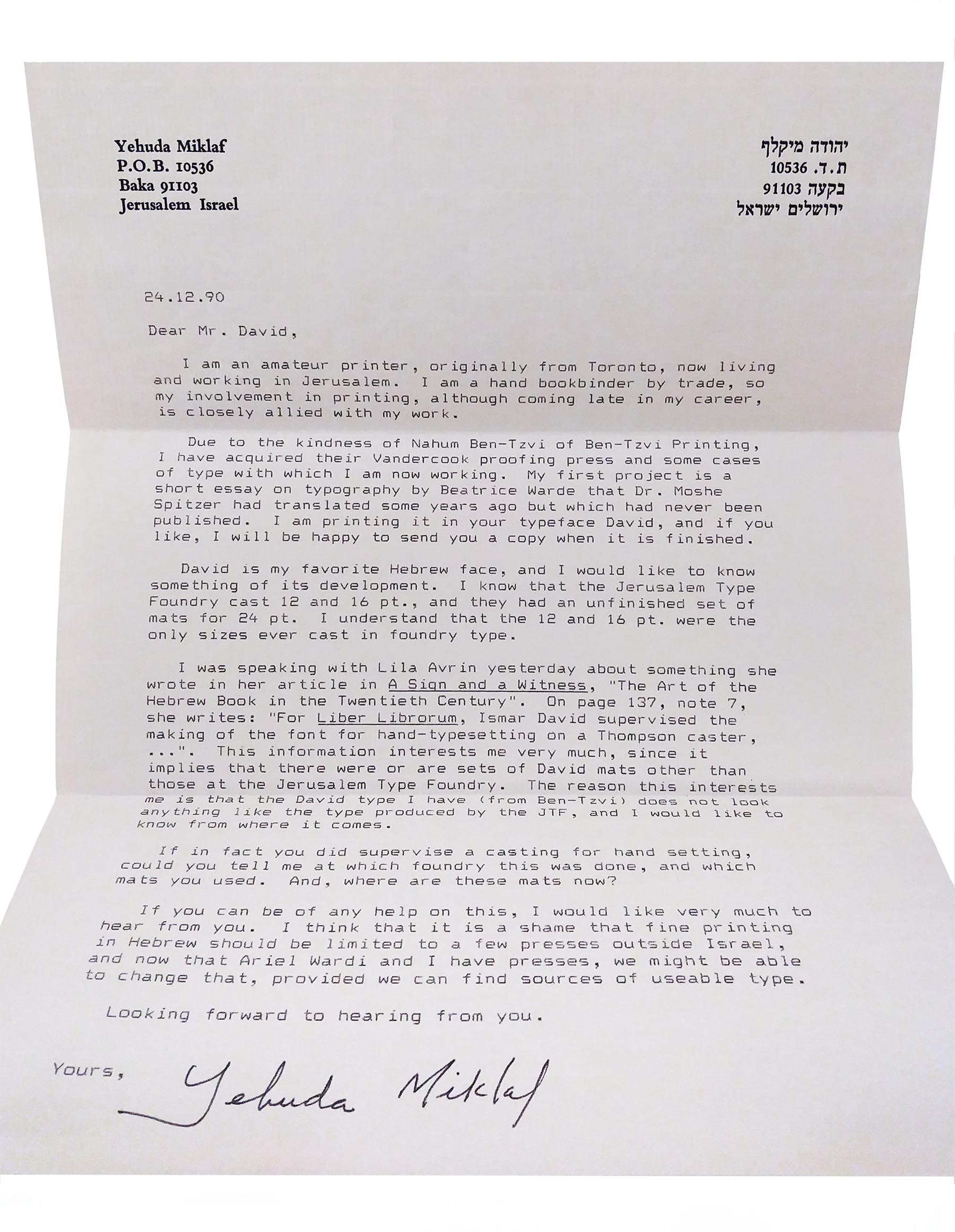
I am an amateur printer, originally from Toronto, now living and working in Jerusalem. I am a hand bookbinder by trade, so my involvement in printing, although coming late in my career is closely allied with my work.
Due to the kindness of Nahum Ben-Tzvi of Ben-Tzvi Printing, I have acquired their Vanderook proofing press and some cases of type with which I am now working. My first project is a short essay on typography by Beatrice Warde that Dr. Moshe Spitzer had translated some years ago but which had never been published. I am printing it in your typeface David, and if you like, I will be happy to send you a copy when it is finished.
David is my favorite Hebrew face, and I would like to know something of its development. I know that the Jerusalem Type Foundry cast 12 and 16 pt., and they had an unfinished set of mats for 24 pt. I understand that the 12 and 16 pt. were the only sizes ever cast in foundry type.
I was speaking with Lila Avrin yesterday about something she wrote in her article in A Sign and a Witness, “ The Art of the Hebrew Book in the Twentieth Century.” On page 137, note 7, she writes: “For Liber Librorum, Ismar David supervised the making of the font for hand-typesetting on a Thompson caster,…”. This information interests me very much since it implies that there were or are sets of David mats other than those at the Jerusalem Type Foundry. The reason this interests me is that the David type I have (from Ben-Tzvi) does not look anything like the type produced by the JTF, and I would like to know from where it comes.
If in fact you did supervise a casting for hand setting, could you tell me at which foundry this was done, and which mats you used. And, where are these mats now?
If you can be of any help on this, I would like very much to hear from you. I think that it is a shame that fine printing in Hebrew should be limited to a few presses outside of Israel, and now that Ariel Wardi and I have presses, we might be able to change that, provided we can find sources of useable type.
Looking forward to hearing from you. Yours, Yehuda Miklaf
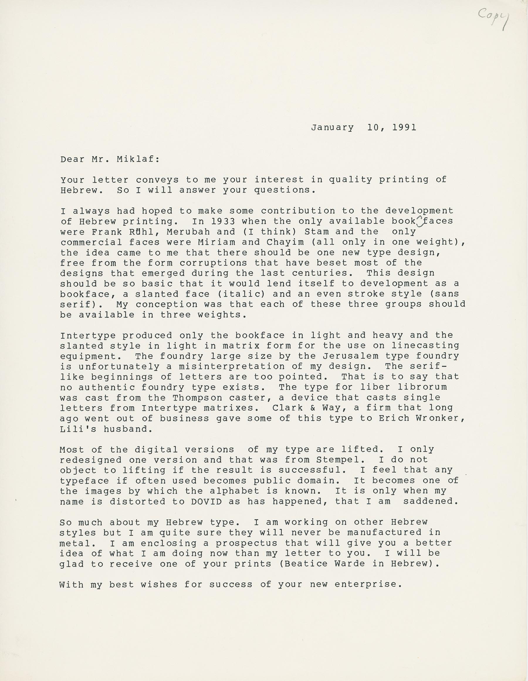
January 10, 1991 Dear Mr. Miklaf,
Intertype produced only the book face in light and heavy and the slanted style in light in matrix form for the use on line casting equipment. The foundry large size by the Jerusalem Type Foundry is unfortunately a misinterpretation of my design. The serif-like beginnings of letters are too pointed. That is to say that no authentic foundry type exists. The type for Liber Librorum was cast from the Thompson caster, a device that casts single letters from Intertype matrices. Clark & Way, a firm that long ago went out of business, gave some of this type to Erich Wronker, Lili’s husband.
Most of the digital versions of my type are lifted. I only redesigned one version and that was from Stempel. I do not object to lifting if the result is successful. I feel that any typeface if often used becomes public domain. It becomes one of the images by which the alphabet is known. It is only when my name is distorted to DOVID, as has happened, that I am saddened.
So much about my Hebrew type. I am working on other Hebrew styles but I am quite sure they will never be manufactured in metal. I am enclosing a prospectus that will give you a better idea of what I am doing now than my letter to you. I will be glad to receive one of your prints (Beatrice Ward in Hebrew).
With my best wishes for success of your new enterprise. [Ismar David]
Yehuda Miklaf in his studio in Jerusalem, holding his Hebrew language edition of Beatrice Warde’s The Crystal Goblet, 2019.
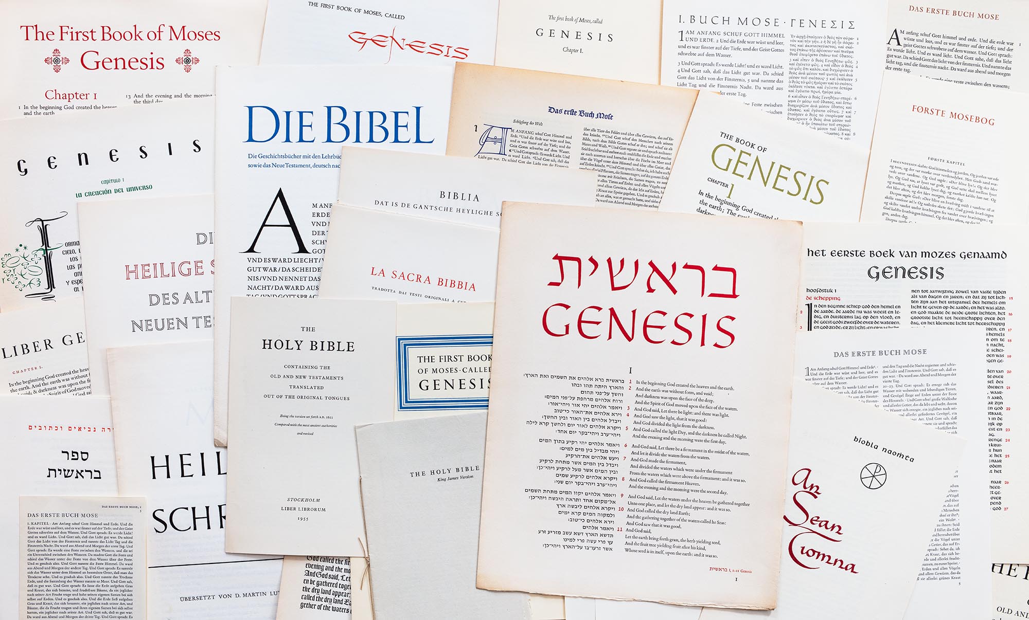
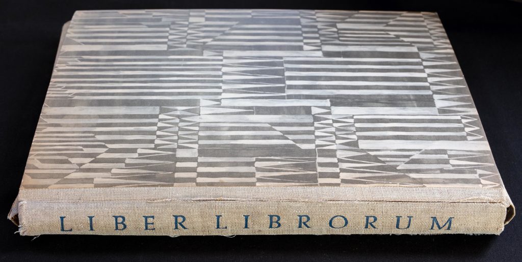
Liber Librorum, a portfolio of Bible designs by international book designers, distributed by the Royal Library, Stockholm, in 1955.
Some of the 43 Bibel designs included in Liber Librorum.
Liber Librorum began as an invitation from a committee, Paul A. Bennet, Francis Meynell, C. Volmer Nordlunde, Raúl M. Rosarivo, Maximilien Vox, Bror Zachrisson and Hermann Zapf, to a select group of book designers to participate in a group project to commemorate the 500th anniversary of the printing of the Gutenberg Bible. The committee and the participants consisted of men from Argentina, Austria, Canada, Denmark, France, Germany, Great Britain, Holland, Ireland, Israel, Norway, Spain, Sweden, Switzerland and America. Each participant was charged with creating “his individual solution of the typographic problem of the Bible.”1Bennett, Paul et al., Liber Librorum 1955, p. 1. Stockholm: N. O. Mauritzons Boktyckeri. After paying a $10 entrance fee, participants were expected to donate their time and materials. Thirty-nine designers produced 43 designs, with non-Latin alphabets (Gaelic, Greek and Hebrew) used in just four. (Henri Friedlaender provided one of the two Hebrew exemplars.) Each supplied 1500 prints of their work and received 15 finished portfolios. The committee gave 200 portfolios to religious, educational and cultural institutions and arranged for 500 to be sold commercially in order to offset the costs of assembly, boxing and shipping. In case of monetary gain, the proceeds were to go to Albert Schweizer’s Lambarene Hospital. Sales were not entirely robust, but in the end, Dr. Schweizer received two payments totaling £375.
Ismar David answered the initial invitation enthusiastically, but asked two questions.2David, Ismar, letter to Bror Zachrisson, February 19, 1955. Ismar David papers, box 4, folder 89, Cary Graphic Arts Collection, RIT. To the first about using illustrations, Zachrisson’s secretary responded: “The Liber Librorum is not conceived as an illustrated project.”3Undated letter to Ismar David. Ismar David papers, box 4, folder 89, Cary Graphic Arts Collection, RIT. To the second, as to whether the deadline could be extended, Zachrisson acceded, and wrote: “As there will be probably some delays in the last minutes, let us agree to November 15. We want you indeed to participate. Please do not inform other participants of this crooked arrangement.” (How often and with how many participants must he have used this line…?) Hortense Mendel approached Harold Plaut of Intertype about sponsorship, telling him that the budget was [$]750 (if possible 1000 to take care of eventualities),4Mendel, Hortense, notes. David papers, box 4, folder 89, Cary Graphic Arts Collection, RIT. but Intertype declined.
For his innovative bilingual design, David chose Bembo, “one of the beautiful Monotoype faces…”5Mendel, Hortense, letter to Joseph Schwartz at Westcott & Thompson, August 16, 1955. Ismar David papers, box 4, folder 89, Cary Graphic Arts Collection, RIT. and his own newly-released David Hebrew. Clarke & Way, under the name Thistle Press, handset the Hebrew type, which had been cast on a Thompson caster. (David gave the resulting metal type to the Wronkers and it later made its way into the hands of Yehuda Miklaf.) The 1500 copies designated for Liber Librorum were shipped on November 23. An additional 5 copies had to be airmailed to Stockholm in order to be included in exhibitions at the Royal Library and the universities of Uppsala, Gothenburg and Lund. The Davids also gave or mailed the Genesis pages to an array of friends, family, professional associates and potential clients in the United States and Israel.
The portfolio case of Liber Librorum, showing the cover paper designed by Sofia Widén.
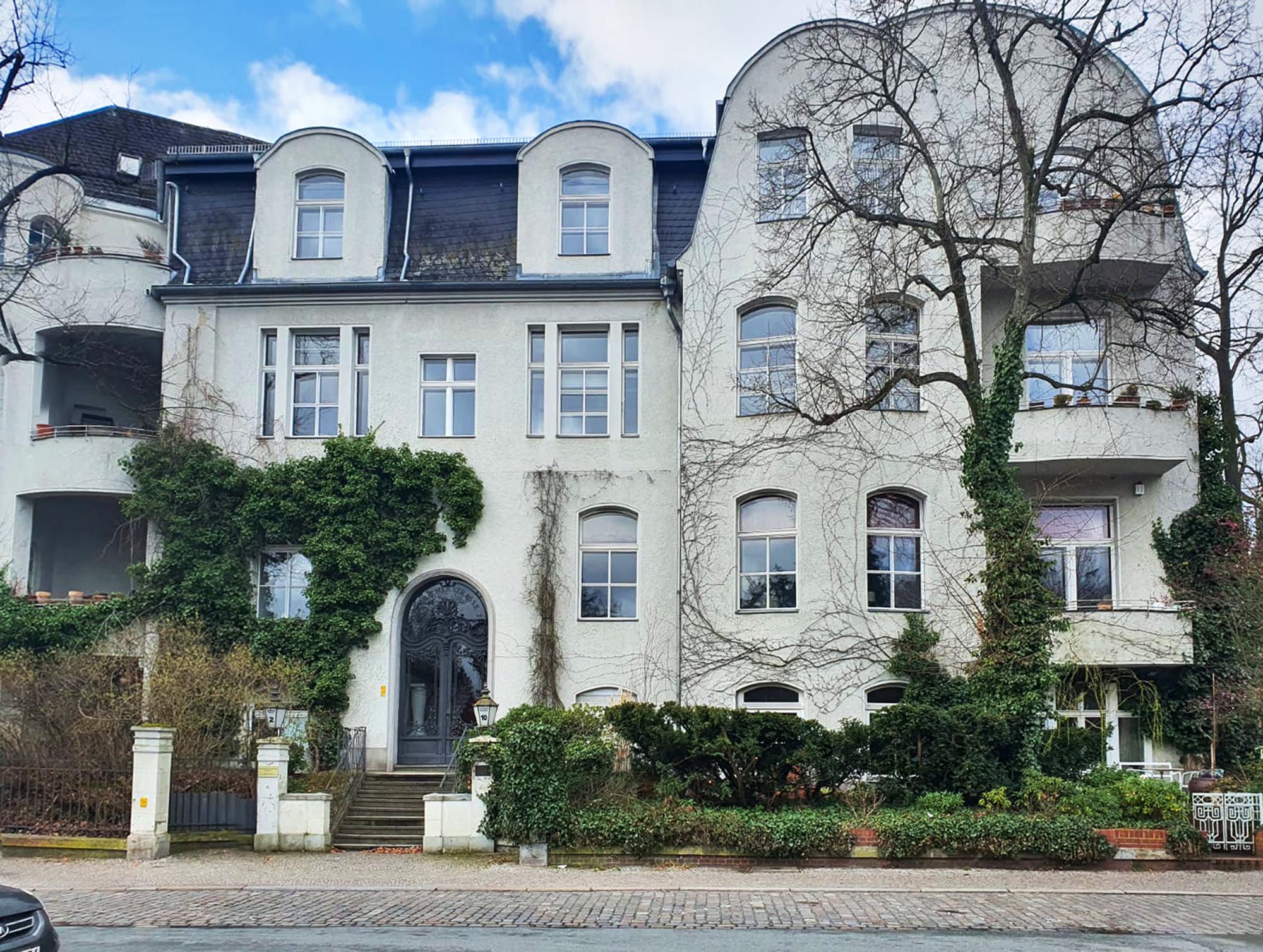
The apartment building at Auerbachstrasse 2 in Berlin.
Auerbachstraße got its name in 1898, in honor of idealistic author and ardent supporter of German unification, Berthold Auerbach, born Moyses Baruch Auerbacher. The gracious apartment house at number 2, called Nickel’sches Haus, was built a year later and still stands, a minute’s walk from the S-bahn station, not far from the edge of the Grunewald Forest and a lake.
In 1920, the building belonged to the Jewish community, from whom Ismar Freund bought it in 1921. His tenants, then, included government functionaries, attorneys and factory owners.1Blumenau-Nieselk, Jutta. Stolperstein Auerbachstraße 2. From the website of the Charlottenburg-Wilmersdorf District. Not much had changed by the time Freund’s nephew, Ismar David, a student at the Städtische Kunstgewerbe- und Handwerkerschule Berlin-Charlottenburg, moved in. As Berlin telephone books of 1931 and 1932 show, David’s neighbors were a solidly middle-class group: a city employee, a masseuse, a director, a business man, a sculptor, a banker, a purveyor of fine foods, a (graduate) engineer and two people of private means.
Seven years after David left for Jerusalem, author Frida Kalischer lived on the third floor and records show her rent (180 Reichsmark) paid to Elise Freund in Jerusalem. Some time in 1942, the National Socialist authorities struck Elise Freund’s name from the property owner registry. In December Frida Kalischer was deported. She perished in Auschwitz on New Year’s Day 1943.2 Ibid.
In 1938 Nazi administrators had changed the name of the street to Auerbacher Strasse, to disassociate it from its Jewish namesake. In November of 2012, the district authorities sought to right at least one wrong and decided (at the express wish of the area residents) to rename the street, Auerbachstrasse.3Auerbachstraße (ehem. Auerbacher Straße). From the website of Charlottenburg-Wilmersdorf District.
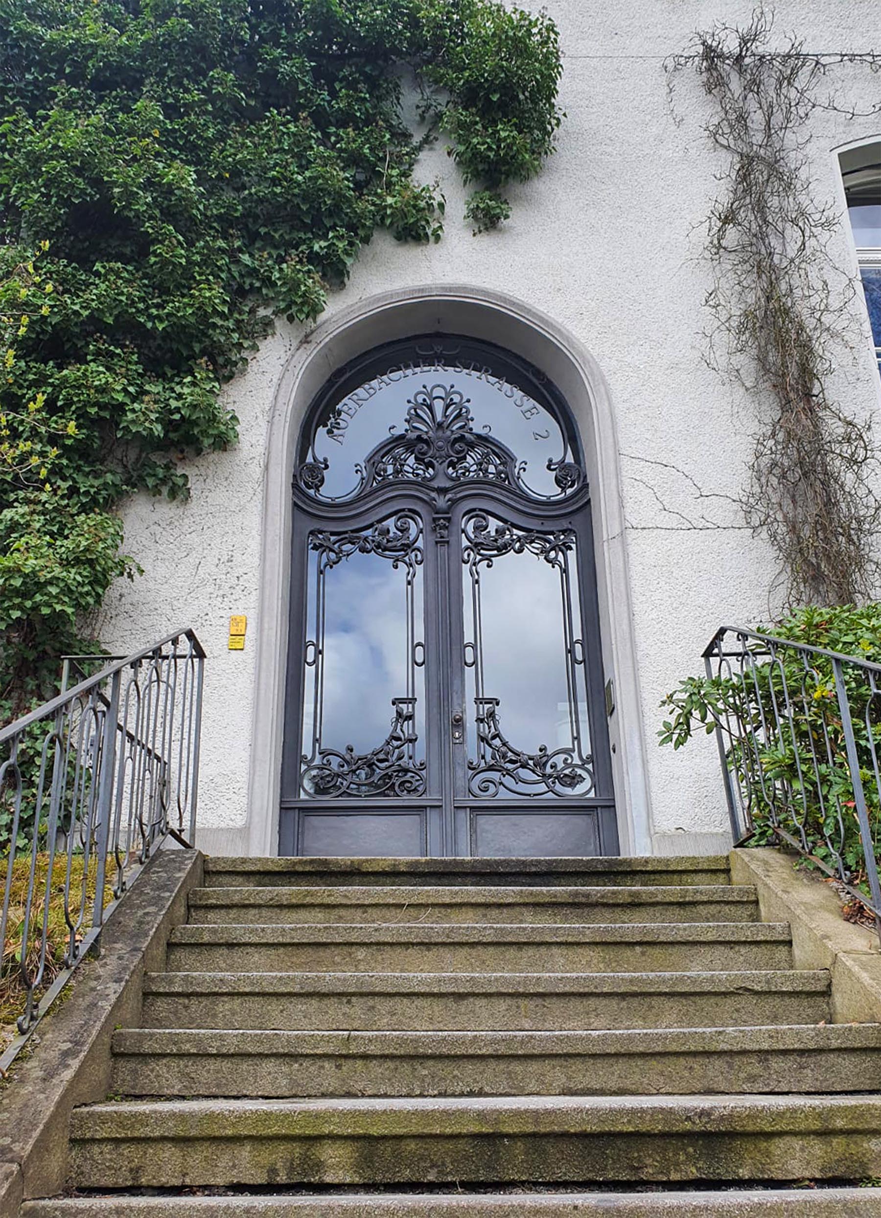
Entrance to the apartment building at Auerbachstrasse 2 in Berlin. Many thanks to Ilka and Korinna for the photos.
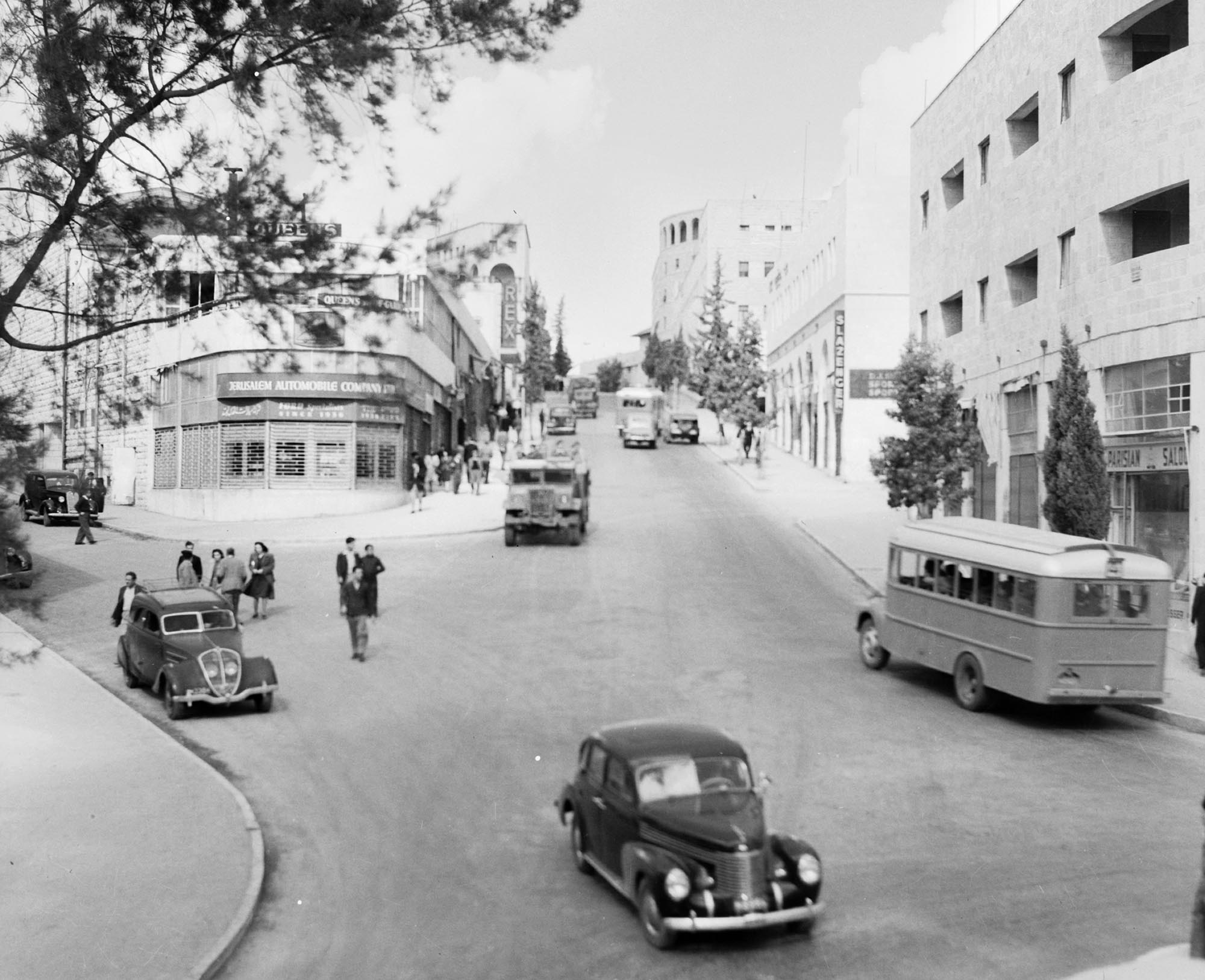
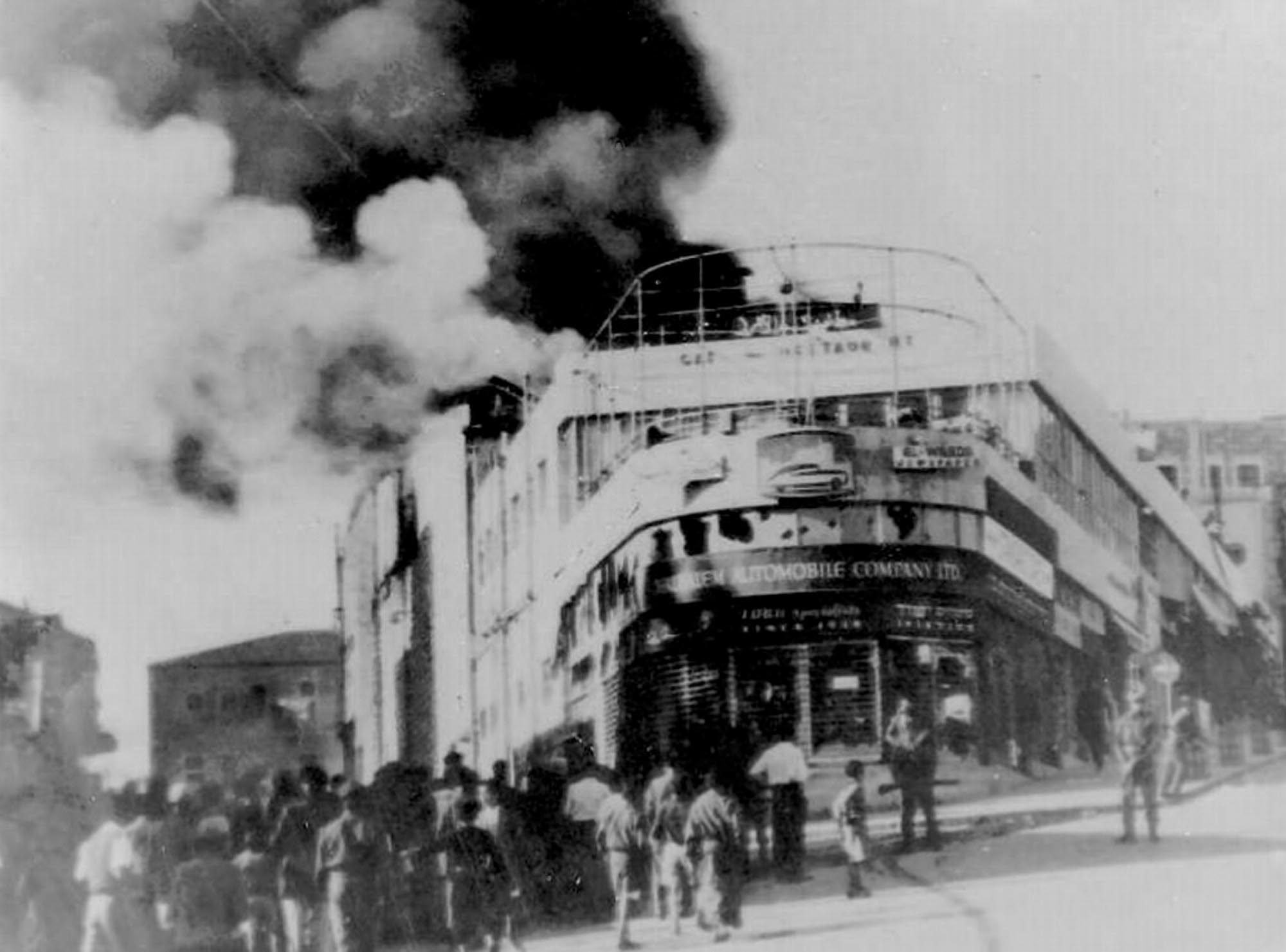
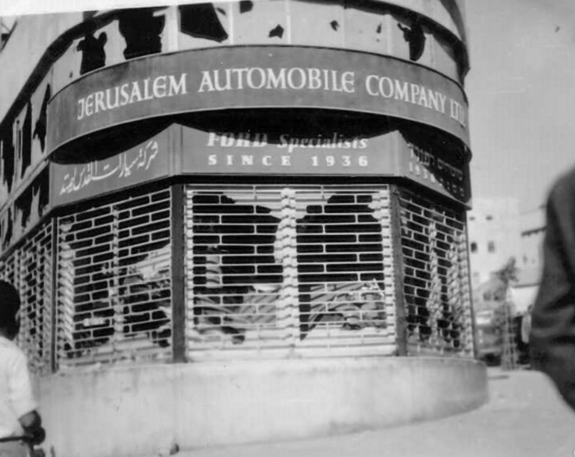
According to its own ads in the Palestine, later Jerusalem, Post, the Jerusalem Automobile Company had been “Ford Specialists since 1936.” Early on, their offices were on Julian Way,but by 1940, they had moved to prominent rounded storefront on Princess Mary Avenue, where they continued as authorized Ford dealers, offered automobiles (including used cars) for sale and rent (on a monthly basis only). After the Second World War, they sold British-made, luxury Rover automobiles as well. The showroom was damaged during the riots of 1948.
Ismar David designed graphics and corporate identity for Jerusalem Automobile Company, Ltd., which was also used in the signage for their Princess Mary Avenue location.
Damage to stores on Princess Mary Avenue during the riots in Jerusalem in 1947-48. Courtesy of the Central Zionist Archive