About Random House

Random House, American publisher, founded in 1927 by Bennett Cerf and Donald Klopfer.

Two years after buying Modern Library in 1925, Bennett Cerf and Donald Klopfer established Random House. They had intended to just put out “a few books on the side at random,” but instead built a publishing giant, presenting many great names, such as James Joyce, James Faulkner, Isak Dinesen, André Malraux, Robert Graves, John O’Hara, Sinclair Lewis, Robert Penn Warren, and successful titles, like Ulysses, Ellison’s Invisible Man, The Cat in the Hat and, The Iceman Cometh, as well as many classic reprints.

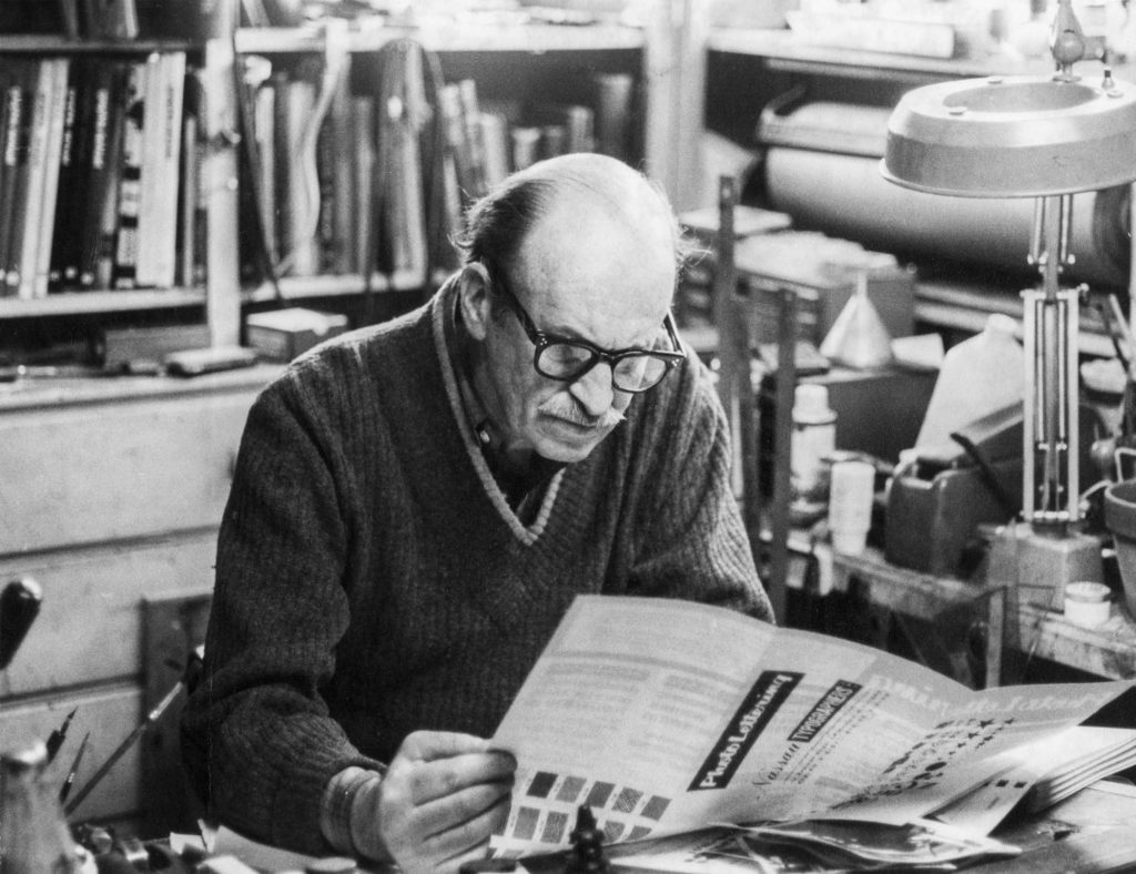
By our count, David designed 31 jackets or covers for Random House (including three for Modern Library and two for Modern Library paperbacks) between 1955 and 1961. Among them is one cultural touchstone for the era, Truman Capote’s 1958 novel, Breakfast at Tiffany’s, as seen in Tom Ford’s film, A Single Man, made 2009, but set in a meticulously recreated early 1960s Los Angeles.

Scene from A Single Man, (2009) directed by Tom Ford.

At Random House, David received his assignments from Charles Anthony “Tony” Wimpfheimer, Regina Spirito and “Ruth K.” Some commissions came with technical limitations, due to size or budget, or with very specific directives as to color and writing style, due to the desires of the editors. For instance, Breakfast at Tiffany’s came with a sketch by Bennett Cerf, a color swatch and a request for “strong Bodoni” lettering.1Notes from Regina Spirito and Ruth K. in Ismar David papers, box 5, folder 119, Cary Graphic Arts Collection, RIT. Turn-around time for a sketch was usually 10–14 days, although rush jobs came in, too. Often sketches were returned with exact instructions for adjustment, but at times, the back and forth must have tried the patience of all concerned. “Are you still with me or have you tossed all this across the room?”2Regina Spirito about Go and Catch a Falling Star on April 23, probably 1957. Ismar David papers, box 5, folder 119, Cary Graphic Arts Collection, RIT.

Ismar David’s Random House book jackets and covers are: Heritage, 1955; A Family Party, 1956; Great Ages and Ideas of the Jewish People, 1956; Of Human Bondage (Modern Library paperback), 1956; The Magic Flute, 1956; The Stoic and Epicurean Philosophers, 1956; And Walk in Love, 1956; The Greek Commonwealth (Modern Library), 1956; Sartoris, 1956; The Valley of God, 1956; Death of a Man, 1957; The Ox-Bow Incident (Modern Library paperbacks), 1957; The Eye of the Beholder, 1957; Go and Catch a Falling Star, 1957; Madame Bovary, 1957; The Catcher in the Rye (Modern Library), 1958; Breakfast at Tiffany’s, 1958; A Knot of Roots, 1958; They Came to Cordura, 1958; The World’s Great Operas (Modern Library), 1959; Love and Money, 1959; The Quick Rich Fox, 1959; Before You Go, 1960; The Faces of Blood Kindred, 1960; On Wings of Faith, 1960; Putting First Things First, 1960; The Seducer, 1960; The Trend is Up, 1960; The Witching Ship, 1960; The Important Thing, 1961; The Wisdom of Buddhism, 1961 and The Mountain Lion, 1962. In 1957, he designed stationery for the firm, which Bennett Cerf “liked very, very much.”3Letter from Tony Wimpfheimer, April 22, 1957. Ismar David papers, box 5, folder 119, Cary Graphic Arts Collection, RIT.

Posted in R

A Father and Two Sons

S. Friedmann Ltd. Technical Works, an Israeli company for the production of heating and household appliances.

Shelf sign
A shelf sign, showing the Friedmann logo. Photograph taken during the Typophiles’ Printers’ Pilgrimage to Israel.

The Friedmanns, father Shmaryahu and sons Laiush and Ferry (aged 15 and 13) immigrated to Palestine in 1926 from Hungary. Using basic equipment he had brought with him, the elder Mr. Friedman opened a modest basement repair shop in the Nahalat Shiva neighborhood of Jerusalem. The two boys helped him fix the small kerosene-fueled stoves that were common at the time, as well as other small appliances and plumbing. Ten years later, after studying the kinds of machinery they repaired, the three men founded Friedmann Ltd. and began engineering and manufacturing their own products. The company expanded rapidly during the Second World War, supplying goods to the British Army. It was a major employer in Jerusalem at the time and the saying was, “Either you work for Friedmann or you worked for Friedmann or you work for Friedmann.”1Wikipedia

S. Friedmann Ltd exhibition
An exhibition of products from S. Friedman Ltd. in a trade fair in Israel, c. 1953. Courtesy of the Friedmann family and their web site about S. Friedmann Ltd.

After the war, Friedmann returned to producing innovative consumer products, eventually even branching out to heaters and refrigerators. But Friedmann today remains most famous for its small household stoves. S. Friedmann died in 1957. With the death of both of his sons in the 1970s, the firm came to an end.

Ismar David designed various graphics for the firm, as well as the iconic father and sons symbol. Ferry and Ziva Friedmann were his friends. David designed furniture for them and a memorial for Ferry Friedmann that remains unbuilt.

Posted in F

About Henri Friedlaender

Henri Friedlaender, 1904–1996, type and book designer, co-founded the Hadassah Printing School and served as its first director.

Henri Friedlaender described his multi-national heritage:

Von Frankreich hatte ich die Liebe zu Klarheit in Form und Wort bekommen; von England Wertschätzung für geschichtlich Gewachsenes und für Weltweite; von Deutschland meine Fachkenntnisse und ein Ahnen der Nachtseite der sichtbaren Dinge; von Holland die Erfahrung, daß schlichte Menschlichkeit wichtiger ist als Spitzenleistungen…1Friedlaender, Henri, Die Entstehung meiner Hadassah-Hebräisch. Hamburg 1967: 37.

From France, I got the love of clarity in form and word; from England, the appreciation of growth over time and the greater world; from Germany, my technical expertise and an inkling of the dark side of visible things; from Holland, the experience, that simple humanity is more important than excellence…

Lyon-born Henri Friedlaender moved to Berlin when he was six years old with his English mother and German father and received all his primary and secondary education there. After graduating from the Mommsen Gymnasium in Charlottenburg, he apprenticed in various printing methods, gaining experience in hand setting, letterpress and intaglio, as well as administrative exposure to engraving. He taught himself lettering and studied for a year at the Akademie für Graphische Künste und Buchgewerbe in Leipzig. Beginning in 1932, he was art director at Mouton & Co. in the Hague. During the Nazi occupation of the Netherlands, Friedlaender could neither live nor work openly and was forced to hide in his own house, seeing only his wife. In 1950 the couple emigrated to Israel, where he founded and led the Hadassah Apprentice School of Printing in Jerusalem. After retiring, he continued working as a free-lance book designer and taught at the Bezalel Academy of Art.

Friedlaender is best known as the designer of Hadassah, a type face he began in 1931, when Schocken asked the Haag-Drugulin Foundry, where he was a printer-manager, whether a modern Hebrew typeface could be created. Haag-Drugulin’s partipation ceased, when Friedlaender left for Holland. Nevertheless he continued developing his ideas. Lettergieterij Amsterdam produced a trial casting in 1949, which necessitated considerable revision. Hadassah was finally issued in 1958. Friedlander also designed three Hebrew typefaces for the IBM Selectric typewriter II typeball: Shalom, Hadar, and Aviv.

In his essay, Toward a Modern Hebrew, in 1959 Friedlaender wrote: “Ismar David started from the simplified Hebrew he had evolved in his practice of lettering. He tried to preserve in type as much as possible of its modern, free character. In the sloped version moreover he introduced motives of italic semicursive, originated in the fourteenth century but still alive. The resulting type is charming, elegant and well suited for not too long texts. For books it is a little too playful and not quite restrained enough.”2Friedlaender, Henri, Toward a Modern Hebrew.P.A..G.A.: Printing & Graphic Arts 7 (1959): 43-56.

Friedlaender must have visited Hortense Mendel and Ismar David in New York during the mid-fifties.

15 September 1957
Dear Mr. David,

A package from you arrived today, and a few days earlier one from the Composing Room, for which you are probably also responsible. Many heartfelt thanks. Very interesting, at a high standard, full of motivation, (which are here more confusing than helpful) (there is also so much work and ideas packed in each and every work, that one can’t process it all—an embarrassment of riches [in French])

I often think back to the hours [with you two] at your home, and also often of America, not in the sense of something I would long for, but as an admirable self-contained entity—like a gifted boy in his teens, who doesn’t at all know where to go with his powers and to whom fate assigned a task, the scope and depth of which he doesn’t understand at all. How are you and your wife? Fully engaged again with interesting work that takes full advantage of your abilities and leads to new discoveries? Without being ground up by the [rat] race? I hope so.

Here, so far, it’s going well. One goes forward in small steps, building the foundation stone by stone, admittedly without the assurance, or let’s rather say: the certainty, that the building will also really stand. Some basis for hope, however, exists.

Best regards to both of you
from Henri Friedlaender

Posted in F

About Viv and Herman Cohen

Herman Cohen, 1905–1997, and Aveve Brown Cohen, 1909–2001, founders and proprietors of Chiswick Book Shop, publishers.

Chiswick Keepsake
Keepsake for the fiftieth aniversary of Chiswick Book Shop. Among those pictured: Bob Jones, Motoko Inoue, Jerry Kelly, Lili and Erich Wronker, Ismar David, John Dreyfus, John Depol, Jack Gulden, Joe Blumenthal, Stephen Harvard, and Viv and Herman Cohen and their family.

Aveve Brown first met Herman Cohen on a ship returning from Europe when she was fourteen years old. Family lore has it that it was practically love at first sight.1Matz, Jenni, ed. Reminiscences and Remembrances of Herman and Aveve Cohen and the Chiswick Bookshop (1935-2001). New York: The Typophiles, 2002, p. 7. Six years later, they married. After gaining experience working for a variety of book sellers, they opened their first shop on West 51st Street in Manhattan in 1935 and, due their own initiative, enthusiasm and audacity, and a bit of luck, it was a success. The shop moved several times through its over 65 years in business, but wherever it was located, it was a center of conviviality and support for artists and admirers of fine printing. Herman was active in antiquarian bookseller organizations, as well as being a member of AIGA. They were great friends of John Fass and early promoters of his Hammer Creek Press publications, which they offered in their catalogues.

They published four books: Aldus Manutius and the Development of Greek Script and Type in the Fifteenth Century, by Nicholas Barker (1985), The Making of the Book of Common Prayer of 1928, by Martin Hutner (1990), John S. Fass and the Hammer Creek Press (1997) and The Book of Jonah, designed and illustrated by Ismar David.

Howard I. Gralla, Herman and Aveve Cohen
Howard I. Gralla, Herman and Aveve Cohen at Robert Leslie’s birthday celebration at the Jerusalem Book Fair, 1985. Photographer unknown.
Posted in C

About the Israel Museum

The Israel Museum was established in 1965 as Israel’s foremost cultural institution and one of the world’s leading encyclopedic museums. It is situated on a hill in the Givat Ram neighborhood of Jerusalem, adjacent to the Bible Lands Museum, the Knesset, the Israeli Supreme Court, and the Hebrew University of Jerusalem. Its holdings include the world’s most comprehensive collections of the archaeology of the Holy Land, and Jewish Art and Life, as well as significant and extensive holdings in the Fine Arts.

Ismar David and the Israel Museum corresponded between 1985–1988 regarding the donation of original drawings of the David Hebrew typeface for their permanent design collection, and a loan of Hanukkah menorahs for an exhibition. Izzika Gaon, Curator of the Israel Design Department of the Israel Museum, visited David’s studio in New York. In addition the museum holds a collection of Ismar David artwork and sketches, donated by Henri Friedlaender.

Posted in I

About Zelda Popkin

Zelda Popkin, 1898–1983, novelist, sister of Helen Rossi Koussevitsky.

Jenny Feinberg of Wilkes Barre, Pennsylvania changed her name to Zelda when she left home to study journalism at Columbia University. She settled in New York, founded and ran, with her husband Louis Popkin, a public relations firm, and wrote occasional articles for magazines. In 1938, Lippincott published the first of her Mary Carner mysteries, Death Wears a White Gardenia. Four more volumes in the series followed. After the her husband’s death, she gave up their business and turned her attention to writing as a profession. She enjoyed her greatest commercial success with Journey Home in 1945.

In late 1946, convinced that there was material for a novel in the Zionist struggle in Jerusalem and that the story badly needed telling, Helen Rossi began to encourage her sister to visit Palestine. Shortly after the declaration of the State, Popkin visited Israel for two months, and did, indeed, plan a novel. In a letter to her Lippincott editors, she described the Israelis who had so deeply impressed her, including Ismar David. He had been in New York, looking into printing methods,1From a resume dated June 14, 1954. when fighting broke out. He cut his visit short. Popkin wrote that David “said when he returned to bomb-torn Jerusalem this winter: ‘I know I am not a fighter but when I come back my friends will say: “David was safe. He was in America yet he returned to us!” and that will give them strength and courage.’”2Popkin, Zelda, a memorandum, 2 pp., n.d., addressed to editors, George Stevens and Tay Hohoff, Box 12, P. Lippincot, 1938-1970, Boston University Archives. Creating Israel, 2020. In her novel, The Quiet Street, she mentions one of his Hagana Posters:

A poster appeared on the walls, a dramatic thing, an arm and a clenched fist with the English words, “It all depends upon you,” and the Haganah symbol of the blue and white flag above the Old City walls. Everyone took these words as his own and worked feverishly as though he alone were the one to defend Jerusalem.3Popkin, Zelda, A Quiet Street, introduction by Jeremy Popkin. Nebraska: Bison Books, 2002.

Ismar David must have first met Popkin during his trip to New York in 1947. Helen Rossi had asked her sister to make some calls and introduce him to people (interior decorator, Julie Lucas and Sadie Engle’s brother, owner of an offset printing plant) who might help him.4Letter from Helen Rossi to Zelda Popkin, October 9, 1947,

Posted in P

Printers’ Pilgrimage to Israel

A Printer’s Pilgrimage to Israel
A Printer’s Pilgrimage to Israel. Among the pilgrams: Dorothy David, Ismar David, Fritz Eichenberg, Toni Eichenberg and Cathy Tyler Brody (back row) and Berthold Wolpe (sitting, left). Courtesy of Jerry Kelly.

Soon after he became president of The Typophiles in 1971, inveterate traveler Bob Leslie initiated group outings. Destinations that could be accomplished in a day rapidly evolved into fully organized overseas tours. To celebrate the 45th anniversary of The Typophiles in 1974, 45 members and their significant others, plus a few European colleagues, made a “Printers’ Pilgrimage to Israel.” They included Fritz and Toni Eichenberg, Alice Koeth, Berthold Wolpe, Hermann Zapf, Raymond Gid, Cathy Tyler Brody, Alexander Lawson ( director of the school of printing at RIT), Helen Barrow (former production manager at Simon and Schuster), Charles Vaxer (director of printing at Esquire magazine), Edna Beilinson of Peter Pauper Press and book designers Marilyn Marcus (Harcourt Brace Jovanovich), Bertha Krantz (Random House) and Herbert Rosenthal.

Leslie enlisted the aid of Israel Soifer and Gideon Stern (Director of the Printing Information Center of the Israel Export Institute) to help plan a whirlwind sixteen days exploring historical and technical aspects of printing in Israel. The Typophiles met Israeli colleagues Moshe Spitzer, Elly Gross, Henri Friedlaender, Miriam Karoly and Jack Jaget and enjoyed receptions given by Jerusalem Mayor Teddy Kolleck and Haifa Mayor Josef Almogi. The group visited Keter, Ltd. (producers of the Encyclopedia Judaica), the Government Printing Plant and the printing plant of the Jerusalem Post; and the Franciscan Press, the Hebron Press and the Peli Printing Works. They went to the Museum of Printing in Safed and the Islamic Museum in Jerusalem. They saw the Alphabet Museum in Haifa and met Gisa Frankel, an authority on Jewish paper cuts, at the Ethnological Museum and Folklore Archives in the city. Friedlaender organized a special exhibit, “The Image of the Hebrew Letter in Israel,” in honor of The Typophiles’ visit. The Jewish National and University Library at Hebrew University arranged a special display of Hebrew bibliophilic books for them. They visited the Schocken Library, the artists’ colony at Ein Hod and Jerusalem’s Burston Graphic Arts Center. Tourist spots were not neglected. In the end, the group managed to see the upper and lower Galilee, the Golan Heights, Caesarea, Acre, Safed, the Dead Sea, Masada and the Judean Desert.

Posted in T

Ismar David Day

Ismar David Day postcard
A postcard, announcing Ismar David Day and mailed to Typophile members, 1974. Ismar David papers, Box 9, folder 224, Cary Graphic Arts Collection, RIT.

From drafts of a talk, given by Ismar David, at the March 6, 1974 Typophiles luncheon at Rosioff’s Restaurant on West 43rd Street in Manhattan.

Dear friends,I am grateful for the honor. I want to use this opportunity to elaborate some more on one of my latest works, The Psalms. The Hebrew typeface and the specific kind of drawings are the two aspects that have involved me a great deal. The Hebrew developed in a time when only a few Hebrew typefaces were available.

When I could not resist the temptation to venture into Hebrew type design, it was clear to me that these new designs would have to move much closer toward their Middle Eastern ancestors and away from those styles that had developed in Europe.

The impact and impression that new surroundings, the Judean landscape, the eastern way of life and a new social environment had made precluded any other conception. But, of course, all technical aspects had to be considered within the framework of western achievements in typographical design. I intended to go one step further than in the conception of a type family and add a sans serif to text face and oblique and I developed these three variations on three weights. Each letter of theses nine variation would fit on the same matrix and line up in print on the same base line. This is always a problem that goes with designs intended for line casting machines. In those days no one in Palestine thought of anything else. I had to come to grips also with proportions of letters and devised a division of the alphabet into three groups, just one group narrow letters, then the group of medium width that included all letters with only one vertical element with the and [a] very few others and the third wide group including most letters with two full vertical elements or more. This system brought a much higher degree of evenness in structure and texture than is usual in Hebrew typography, which too often suffers from spottiness.

The new forms, which I developed, I tried out in newspaper ads, as display matter and on sign boards, of which I designed many during this period. I gained confidence as I observed the acceptance that was given to these new forms. After about 15 years since my start I finally prepared final drawings for Intertype. Unfortunately the three sans serif designs were not included in Intertype plans. Since then the accepted deigns for the text face and its oblique companion have gained wide acceptance. While in the beginning, their use was limited to commercial matters, more and more books are now set in these faces and it does not any longer seem strange to see a book like The Psalms set in my Hebrew.

That much about type. Now about my drawings.

While I admire western art I am drawn toward the Oriental concept that uses symbols but never tries to imitate nature or to create illusions of realities. But these symbols are rendered so that they not only stand for objects, but convey qualities of it as well as a mood and atmosphere. There is a great difference between the simplistic symbol like the red cross which you can only recognize for what it is after you have learned its meaning and the brush delineation of a blossom on a Chinese screen that can convey so much beyond the form which it symbolizes. In my work, lines do not any longer define shapes, but become symbols like letterforms, being straight or curved and modulated. They are grouped to form patterns to suggest and stimulate, but never to define. A lot is left to the viewer. Specifically for drawing s that are accompanying religious texts , it seems to me important that the views is not irritated by the style of attire of figures, the fashion of beards or hair styles, but is allowed to let his imagination wander.

Of course, I also like to use color. But here, too, I will not use color in a realistic fashion. Color can create texture and background. It can create tension. And if used successfully, it will complement or support my lines and strengthen their impact. So I use lines and color, but mainly lines, not in the framework of isms, like realism, expressionism or impressionism, but to serve my own needs to communicate my ideas [and] my feelings, but in the service of the book.

Posted in T

About the Typophiles

The Typophiles, probably founded around 1932 and still active, an association that fosters the appreciation of fine typography and bookmaking with luncheons, lectures and publications.

One upon a time, when New York City was the center of the book industry, a group of men in the various related printing trades formed an informal monthly lunch club. They met at restaurants in Manhattan to chew the fat and share examples of their work. Luminaries like Fredric Goudy and Bruce Rogers attended. In these early days they took to joyously and somewhat spontaneously producing collections of their own printed matter with whimsical titles like Spinach from Many Gardens (for Goudy’s seventieth birthday), Barnacles from Many Bottoms, scraped and gathered together for BR…, and Diggings from Many Ampersandhogs.

In 1940, the Typophiles initiated a subscription fee for regular publications, which they called chap books, as well as pamphlet commentaries, the latter amounting to a kind of newsletter. They remained, however, a volunteer and non-profit organization. In 1955, when Ismar David provided the lettering for the cover of Chap Book Commentary 26, the Typophiles were still a male-only organization—women could join beginning in 1970—and still characteristically quirky. Something of the nature of the group, or more properly of its guiding light and founding member, Paul Bennett, can be seen in his guidance On Getting the Chap Books.

There’s no mystery about becoming a Typophile subscriber and getting the Chap Books, we repeat. This may require a bit of waiting, but that’s because our volunteer set-up places a natural limitation on what we can handle. The turnover among subscribers is small. There are several deaths each year, unfortunately. And occasionally economic difficulties mean dropping out.

Our subscription procedure is simple: We accept only subscribers who want our books and will be patient in waiting for them; who seldom write about details, and who send renewal funds promptly upon notice. This since there’s little time for correspondence or the chore of record-keeping.
Applicants must send on a minimum of $20. in advance. They move from the waiting list as subscription vacancies occur. Funds are allocated in these directions: Membership fee, $4. Annual dues,$4. And forthcoming books at the rate of $2 each.

Potential subscribers, in short, must have faith in our judgment and in what we do—there’s no time for notes, follow-ups or the customary business procedures.

Institutional subscriptions, for reasons outlined previously require a minimum deposit of $26, so inquiries may be halved. Remember, please, we have no time to acknowledge orders, sign vouchers, or do special billing.

If you have a candidate who can bear with these peculiarities, and who wants in, act accordingly.
For The Typophiles,
Paul A. Bennett

In 1955, too, The Typophiles gave out 200 copies of Daniel 3, a small book which World Publishing had given out for the holidays the year before. Ismar David had supplied the pattern on its slipcase, as well as lettering and illustrations.

After Bennett died suddenly in 1966, The Typophiles were forced to make their organization a bit more organized, formally incorporating as a non-profit, educational organization in the State of New York, adopting rules and electing officers. They elected Eugene M. Ettenberg as their first president in 1968. Robert Leslie, who succeeded him the following year, put his enthusiastic stamp on The Typophiles in many ways, including arranging typographic-themed junkets for the group, including trips to Europe and Israel. Abe Lerner followed Leslie as president.

Over the years, many guests and members have spoken at the luncheons, among them, Ismar David on March 6, 1974. David traveled to Israel with The Typophiles on their “Printers’ Pilgrimage to Israel” in 1974 and for Leslie’s 100th birthday celebration in 1985.

Posted in T

Larry the Goniff

H. Lawrence Hoffman, 1911–1977, book jacket designer, illustrator, painter, teacher.

H. Lawrence Hoffman
Larry Hoffman at his desk.Courtesy of Caroline Hoffman.

A RISD grad (class of 1934) and post-grad, H. Lawrence Hoffman had a remarkable career during which he designed more than 650 book covers and jackets—as he kept neither records nor his own artwork, the exact total remains elusive and growing. Until 1948, he worked mainly for mass market paperback publishers, creating a dazzling variety of pulp fiction and mystery covers. While working with Sol Immerman, he illustrated all but 11 of the first 125 covers for Popular Library. He rendered the cover illustration as a smaller line drawing on the title page. After 1948, he left frenetic, poorly-paid mass market covers behind to design dust jackets for traditional publishers. He contributed the jacket, endpapers and illustrations for The Canterbury Tales of Geoffrey Chaucer, which was among the AIGA’s fifty best books of the year in 1948. Hoffman taught illustration and lettering at Cooper Union from 1960–1967 and was a Professor of Art at C.W. Post University from 1967-1976. Filmmaker David Hoffman, made this short video about his father and his creative, humorous work.

In the Spring of 1972, Dorothy and Ismar David had friends over to their apartment. Bob Leslie, Phil Grushkin and Larry Hoffman were present. A silver spoon went missing…

Letter from H. Lawrence Hoffman
Letter from H. Lawrence Hoffman, May 1972.

May 1972

Dear Dorothy:

Last night we were dressing for a dinner party—the first since we visited you—and guess what I found in my pocket. I decided to mail it to you anonymously— but Eve voted that down! So now you know I am the culprit! But I assure you the item was planted on me— probably by Gruskin [sic] or Leslie—both of whom have shifty, untrustworthy eyes.

We also send our Love
Larry the goniff.

Announcement from H. Lawrence Hoffman
Change of address announcement from H. Lawrence Hoffman.
Posted in H