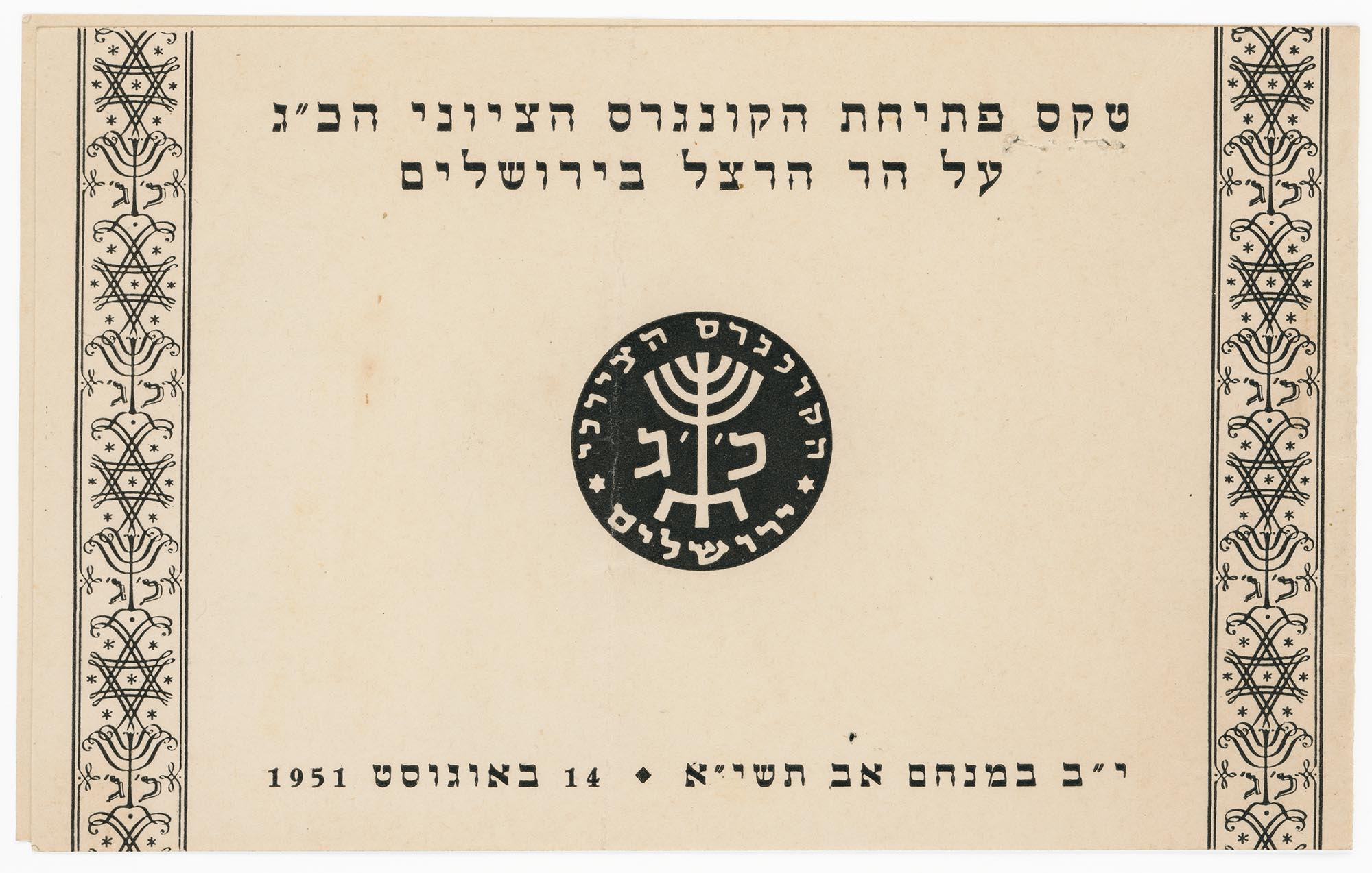
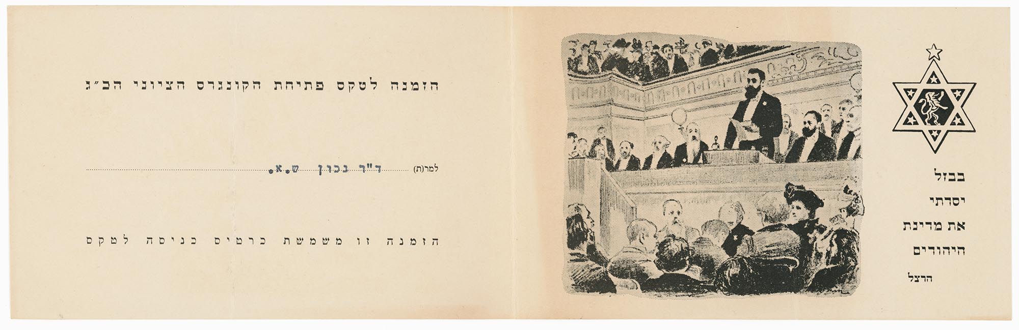
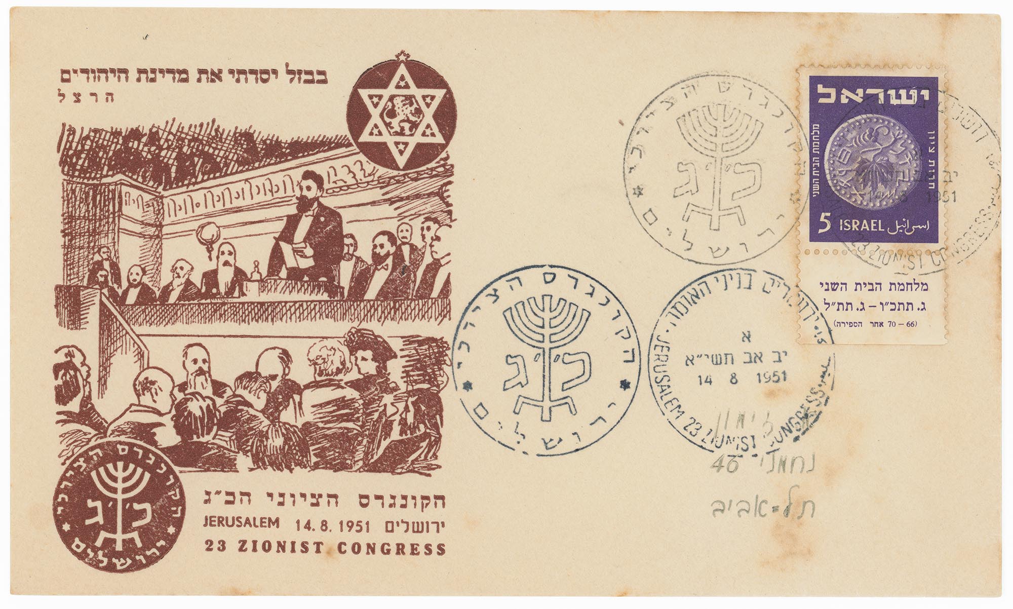
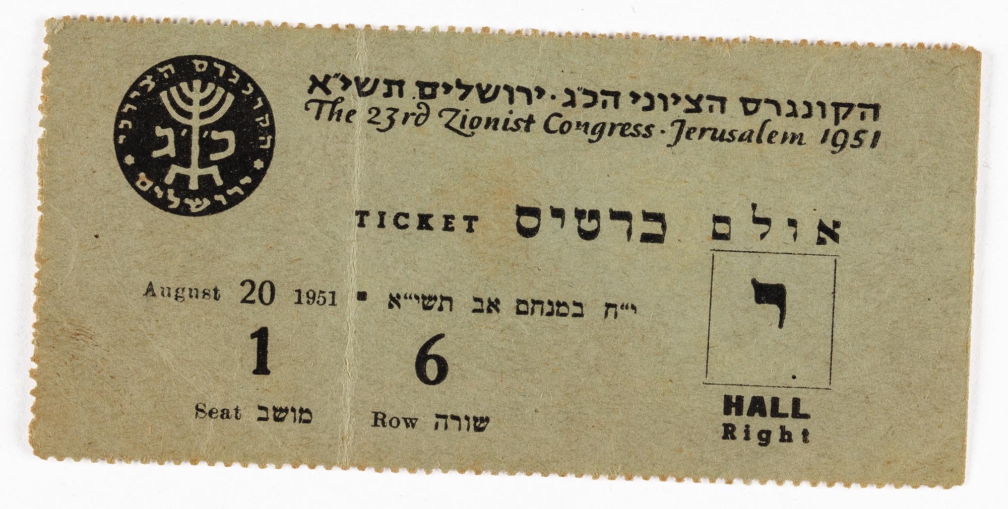
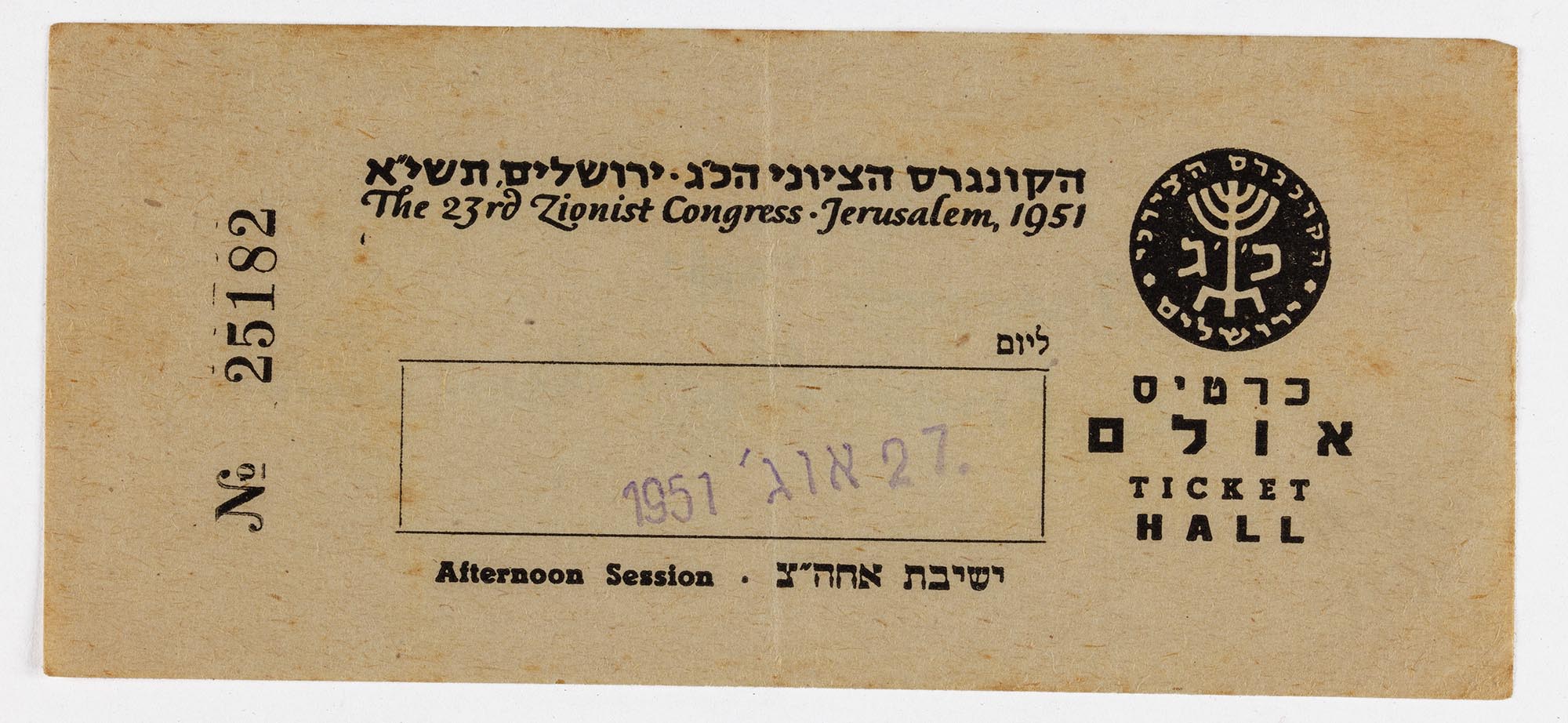
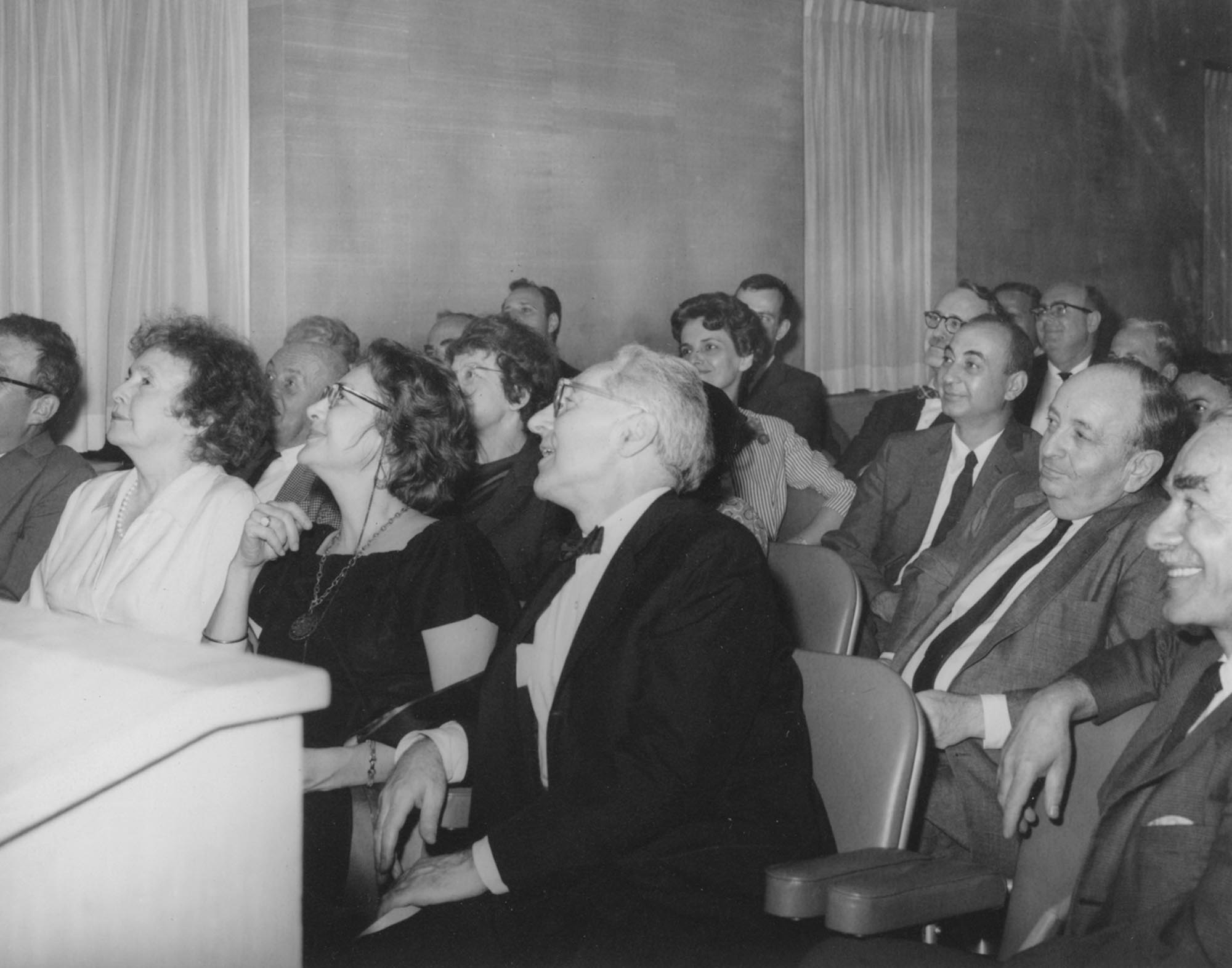
Theodor Herzl established the Zionist Congress in 1897 as the legislative authority of the Zionist Organization. Early congresses took place in Basel, Switzerland and other European cities. With more than a little pride and joy, the 23rd Zionist Congress became the first to take place in the State of Israel.
The 23rd Zionist Congress convened in Jerusalem on August 15, 1951. It faced complicated and contentious issues principally because the major goal of Zionist movement—the creation of the State of Israel—had already been achieved. When the congress wrapped up on August 30th, the delegates had not ratified a new “Jerusalem Program” to replace the old “Basel Program,” concentrating instead on the less radical necessities of absorbing immigrants in Israel and fostering unity among Jewish people.
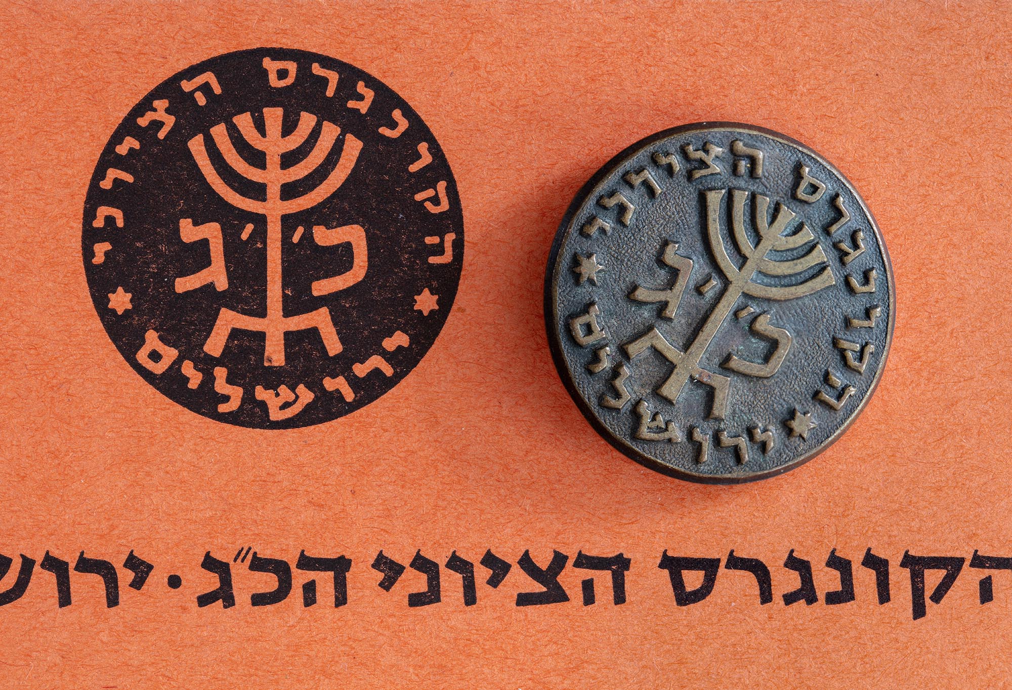
Ismar David designed various graphics for the 23rd Congress. His designs were used again for the 24th Congress in 1956, with alterations by Emanuel Grau.
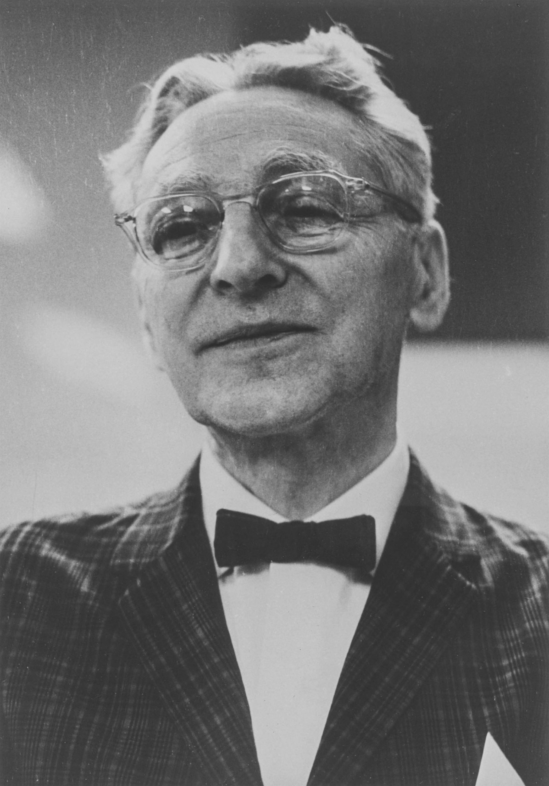
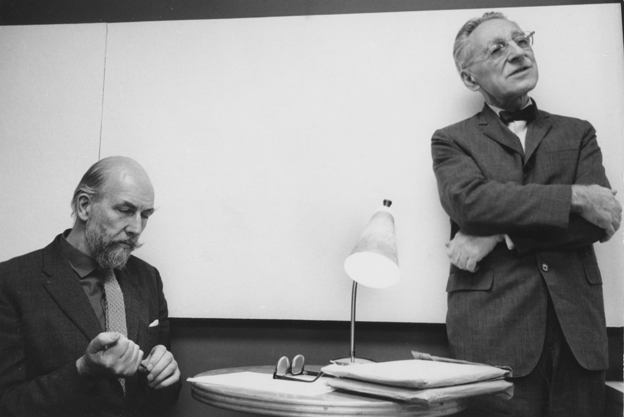
Paul Standard, 1896-1992, calligrapher and author.
Paul Standard in an undated photograph. All photos courtesy of Jerry Kelly.
In the December 1947 issue of Women’s Day, Paul Standard set out his goal: to supplant writing methods, like the Palmer system, with Ludovico Arrighi’s 1522 model, La Operina. His article, complete with diagrams and charts, received an enthusiastic reception from his colleagues in Europe, including Jan Van Krimpen, who translated it into Dutch.1Printing News, October 1, 1983. Although Standard tirelessly advocated for teaching broad-edge italic handwriting to children, his most lasting impact lies in his works documenting the revival of calligraphy in the twentieth century and in his support of a young German calligrapher named Herman Zapf. Fluent in German, Standard translated Zapf’s works for many years and helped Zapf in innumerable ways, during his early visits to the country.
Tall, elegant, old-world in style, Paul Standard was a journalist, an editor for the Associated Press and a publicist for the Canadian Pacific Railway. He and his wife Stella, a cookbook author, lived in a book-lined apartment in the east 60s in Manhattan and were fixtures at graphic arts events in New York City. He taught at the Parson’s School of Design and at Cooper Union concurrently with Ismar David. In 1983, the Type Directors Club awarded him its prestigious TDC Medal.
Paul Standard’s review of Our Calligraphic Heritage appeared in Fine Print, volume VI, number 2, April 1980.
The box for Our Calligraphic Heritage in its easel position.
David, Ismar. Our Calligraphic Heritage. The Geyer Studio Writing Book.
New York: The Geyer Studio, [1979].
Oblong 8vo. 38pp., plus thirty-four 4-page folders,
all enclosed in a cloth-covered wooden easel-case.
Signed by the author/calligrapher.
$67.50 plus $3.50 shipping from Geyer Studio,
P.O. Box 1311, New York, New York, 10008.
We need hardly say that our calligraphic heritage was not invented by Ismar David. But it is perfectly true to say the Our Calligraphic Heritage is a book which present that tangled heritage in terms and figures of uniquely graceful clarity, to enrich the taste of every living practitioner of letterforms, and to give (perhaps for the first time) a full view of a landscape of letters to a world readership.
It is a heritage of enormous scope, hitherto lying scattered in many hundreds of scholarly volumes available to specialists, but now taken in hand by a scholar-artist who is also an artist-scholar. Undaunted by the complexities of the task, Ismar David has discerned the threads of related families of letters, and has presented them in a text supported by graphic illustration, enlightening to the reader and inspiring to the practitioner. Seventeen styles are presented, beginning with Classic Roman Capitals, and continuing through various uncials, Carolingian Minuscules, Gothic, Humanistic, Chancery, Fraktur, etc., and ending with contemporary italics.
To produce such a work, the very boundaries of the book-making art had to be extended, as its title page declares: “The Geyer Studio Writing Book — Text, Charts, and Compositions by Ismar David.” It therefore consists of three major units: first, a paperbound writing book containing a narrative text with clarifying charts and figures for each style; second a set of seventeen folders to display the major historic styles, with printed remarks and graphic detail as needed; and third, a series of seventeen folders, each with a different multi-color calligraphic composition by Ismar David, to show how each classical form can be adapted into motifs for current use in the graphic arts. All three components are brightly distinctive in their use of color. This trinity of parts is housed in a wood-frame box with a heavy buckram cover. This latter feature turns it into something new in bookmaking because it is so ingeniously hinged as to become a lectern whereon a single folder or series may be placed, its bottom edge resting on a ledge to keep the chart vertical, while the reader is free to flank the lectern at left and right with other folders needed for instant comparison. This device makes detailed study of the forms a straightaway instead of an entangling process. And since the reader can easily bring forward the two or several folders needed to decide some point of difference or similarity, he will have more comfort in this than the usual textbook.
I have spoken at length of this bookmaking breakthrough because of its novelty. But I must add that every page of text and every style of letter shown is made with such exemplary finesse and accuracy as could only be lavished by an author solidly informed and long in love with all letters and with worth bookmaking.
The interior folder of Our Calligraphic Heritage, containing the booklet and 17 calligraphic compositions.
Ben Shahn, 1898–1969, painter, lithographer, photographer, activist, lecturer, teacher.
Born in Lithuania, Ben Shahn immigrated with his parents and siblings to the United States in 1906. After studying in America and Europe, he rejected modern European art in favor of social realism, bursting onto the American art scene with his series of paintings, The Passion of Sacco and Vanzetti in 1931–32. They remain perhaps his most iconic work. Shahn made over 6,000 photographs for the Farm Security Administration during the Depression. He designed and executed his own murals, experimented extensively with lithographs and silk-screens, taught, and lectured widely. He often treated themes of social progress and social protest, but also had a special interest in lettering. He had had an intense relationship, he said, with typography, during his apprenticeship years. Both Roman and Hebrew lettering figure in his work.
By the mid fifties, Shahn was at the height of his career and Ismar David, a relative new comer. Shahn had lived, since 1938, in the Jersey Homesteads (now called Roosevelt), a few miles from Princeton University, which exhibited his work in the 1940s and ’50s and eventually awarded him an honorary doctorate in 1962. On October 13, 1954, Gillette Griffin, Director of the Graphic Arts Division of the Princeton University Library approached Ishmar [sic] David with a proposal that seems to have involved quite a bit of foot-dragging:
Dear Mr. David:
I have been meaning to write for several months now, ever since Ben Shan [sic] suggested that perhaps you and he could combine efforts on a joint exhibition of your calligraphy for the Graphic Arts Division here at Princeton. I would like to suggest that the exhibition might be principally of Hebrew calligraphy, but if you have any other examples of calligraphy that you think interesting, it might be nice to include them too. May be you and Mr. Shan could work out what you would like to show together, and I will get in touch with him. If possible, I would like to put the exhibition up sometime in November.
David responded the next day, that he had written to Shahn and was interested in the exhibition, but that the time to plan such a project was unfortunately short. Shahn responded three weeks later.
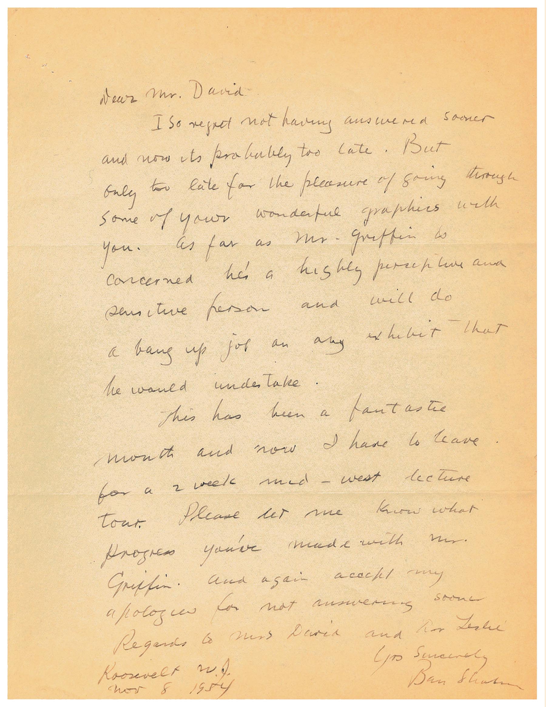
Dear Mr. David
I so regret not having answered sooner and now it’s probably too late. But only too late for the pleasure of going through some of your wonderful graphics with you. As far as Mr. Griffin is concerned he’s a highly perceptive and sensitive person and will do a bang up job on any exhibit that he would undertake.
This has been a fantastic month and now I have to leave for a 2 week mid-west lecture tour. Please let me know what progress you’ve made with Mr. Griffin. And again accept my apologies for not answering sooner.
Regards to Mrs. David and Dr. Leslie Yrs Sincerely Ben Shahn Roosevelt, N. J. Nov 8 1954
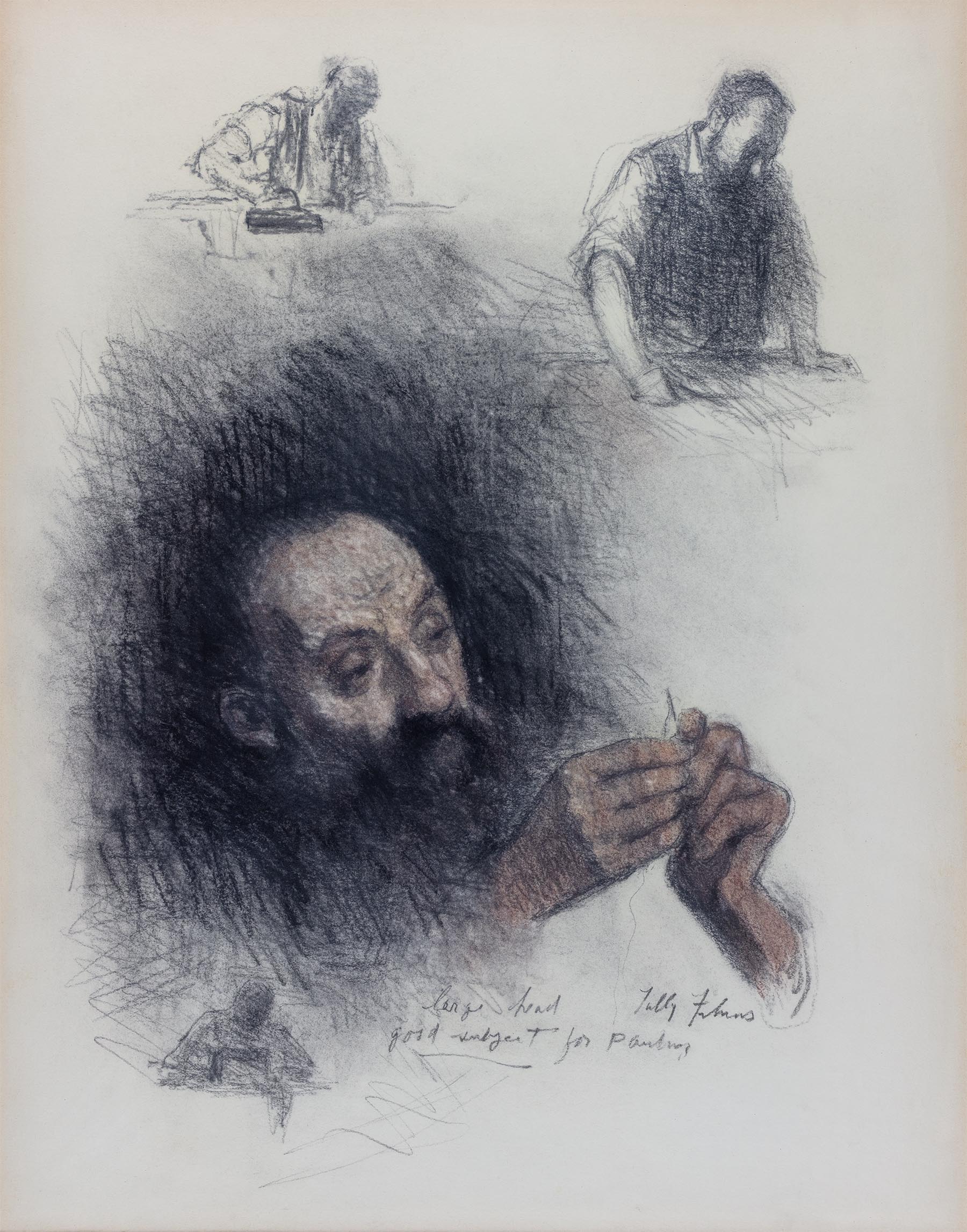
Tully Filmus immigrated to the United States with his parents at the age of 10 from Ataki, Bessarabia. He studied at the Pennsylvania Academy of Fine Arts and the Barnes Foundation, and spent 2 years in Europe on a scholarship. Settling in New York, he shared a studio with Willem de Kooning. He taught at the Cooper Union from 1938–50. He was known for his portraits of notable people, like Eleanor Roosevelt and Jonas Salk, as well as many works on Jewish themes.
In the words of Isaac Bashevis Singer:
Tully Filmus is an artist who refuses to be hypnotized by fashion. He is not afraid of “telling a story” even though this is considered a terrible sin among the art critics of today. He is not against experiment but will not take part in a “revolution” which has already all the signs of a cliché. Tully Filmus is still observing nature and drawing from its treasures. His courage in being true to himself and his concept of art evokes admiration for him and his work.1Filmus, Tully. Tully Filmus: Selected Drawings. With an essay by Isaac Bashevis Singer. Philadelphia: Jewish Publication Society of America, 1971, inside front cover.
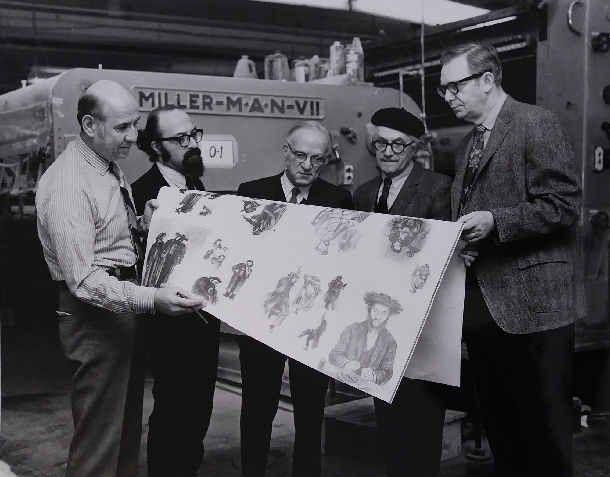
Ismar David designed the book, jacket and chapter titles for Tully Filmus: Selected Drawing in 1971. The publication won a Certificate of Award at the Twenty-seventh Annual Philadelphia Book Show in 1972.
Emmanuel Grau, graphic designer, type designer, painter, illustrator, teacher and head of the Department of Applied Graphics at Bezalel.
A 1940 graduate of the Bezalel Academy of Arts and Design himself, Emmanuel Grau became a teacher there in the 1950s and went on to head the Department of Applied Graphics. He is credited for designing the lettering and signage for the Hebrew University in Givat Ram campus 1958, the logo of Moshe Spitzer’s publishing house, Tarshish, book illustration and posters. He was a member of the Jerusalem Group of Commercial Artists. When Ismar David’s designs for the 23rd Zionist Congress were re-used for the following Congress, Grau made the necessary adjustments.
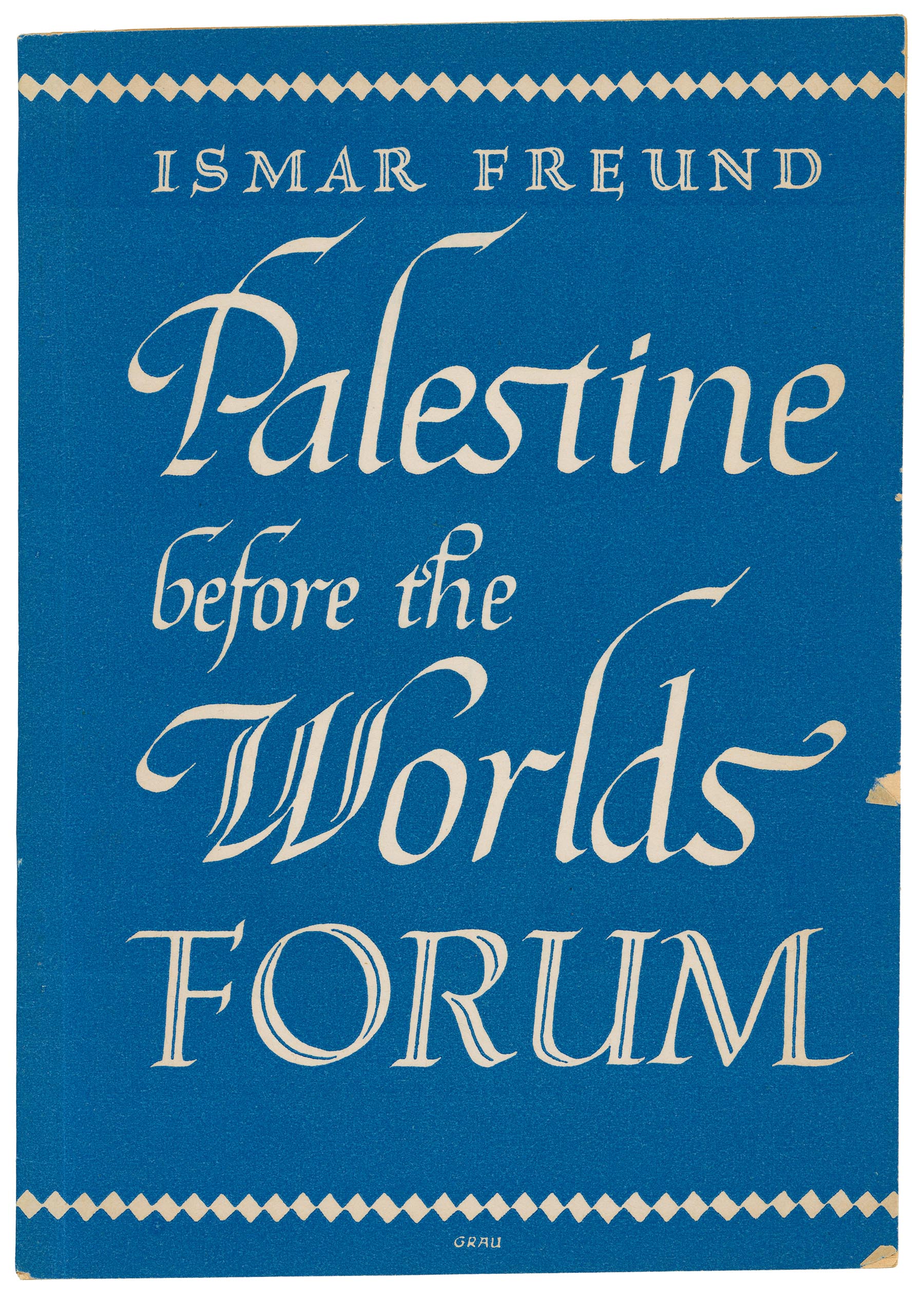
Palestine before the Worlds Forum by Ismar Freund, cover design by Emmanuel Grau. Rubin Mass, Publisher, Jerusalem, 1946.
A typewritten review by Ismar David for Reform Judaism, October 1972.
Ben Shahn
Edited by John D. Morse
Praeger Publishers
$13.50
This book will tell the reader a great deal about Ben Shahn whose work, perhaps more than that of any other painter, mirrors the period that began with FDR’s presidency and lasted for almost four decades. But most important it lets the artist speak for himself. Essays, articles, lectures and letters all written by Ben Shahn, as well as in interviews and discussion, form the core of this book.
Throughout this book Ben Shahn conveys his deep involvement in the social and political life of his era. From it, his paintings and drawings have derived their strength and power and their relevance. As an artist committed to the present, he had to come to grips with all the different currents and trends of the twentieth century; he had to understand his contemporaries and their work. In this search he was guided by a keen sense for the genuine. But in his own work, abstract composition problems or formalistic approaches to color or texture have remained secondary. His work has been dominated by the manifestation of his strong urge to communicate his social concerns, his compassion for man, to his audience, the very society of which he felt he was an integral part.
Ben Shahn found himself, he found his way, his very personal approach to art, after some soul searching relatively early in his career. His images, his color schemes were the reflection of his emotional life, into which gradually his Jewish awareness penetrated. So it is not just for some of the Jewish themes or characters from the Hebrew alphabet that appear from time to time in his work, but for the almost metaphysical quality reflecting his Jewish feelings and sentiment that he deserves to be considered one of the great Jewish artists.
Ben Shahn lectured a great deal. He was one of those straightforward men who preach what they practice. Reading this book should be stimulating to anyone interested in art. But it will be of special value to the young aspiring artist. It should help him to find his way by finding and understanding himself.
One should not forget that Ben Shahn was first and foremost a painter, print maker and graphic artist, and so while reading this book one naturally has the desire to see his work. Neither the selection of illustrations nor their reproduction does justice to his achievements. But this will always be a problem concerning any book of this kind that deals with an artist whose main accomplishments are in the visual rather than the literary field.
An undated typescript for Ismar David’s evening class at Cooper Union, almost certainly from the 1950s.
Let me introduce myself—I am your instructor, Ismar David. I am going to do my best in the weeks to come to acquaint you with a subject which I hope you will become as enthusiastic about as I am. I look forward to many pleasant hours with you as we explore this subject together and I trust you will find them so. I would like you to feel free to talk to me about anything that is not clear as I describe it—we will reserve a period in each session when you may ask questions that pertain to the evening’s work.
And now let us begin.
I want to discuss with you this course called LETTERING and to outline our program. We will concern ourselves mainly with what is known as the ROMAN alphabet or rather the Roman letter family and it’s derivation.
You all know Roman letter forms, of course, and you are able to read and write them without being conscious of doing just that. When you were children, you learned reading and writing in school and you were probably more conscious of the appearance of these forms at that time. Later this reading and writing becomes almost mechanical and more automatic and you are not aware of the individuality of each letter.
Now it is my job again to make you more conscious of these forms. We will notice nuances of measurements and proportions of letter forms, by seeing and producing them and you will train your eye and your hand—but most important, your mind. You will develop your judgment and your taste which you will need whenever you are confronted with problems of lettering. And like all knowledge, you will find that this will help you in other problems of aesthetics.
For the purpose of this discussion, we divide letter-forms into two major groups:
One: the type which is available for use in any form of printing and comes to the typographer or printer in a “ready-made” form.
Two: the letters made by hand, individually (and this is the group with which we will principally concern ourselves in this course.)
Without going into detail about the first group, I might say that printing from movable type (more or less as we know it and use it) dates from the middle of the fifteenth century. The inventor probably was Johann Gutenberg, and while it is not clear to us when he cast his first type, the year 1440 is the accepted date for printing coming to life. He conceived the idea of making metal molds from individually cut letters and cast in those molds single letters which were later assembled. After they were used for printing, they were distributed and were available for re-use.
Prior to Gutenberg, printing on a small scale was done, but such printing was produced by woodcuts. Full pages were cut into the wood, in reverse, and books printed from them were called “block books.”
So much, at present, for the first group.
Now, for the letters made by hand. Let us first acquaint ourselves with a brief history to which we will come back with amplification from time to time during this course.
All of us take for granted, once we become literate, that what we have to say we are also able to write down. We do so by using graphic symbols—our alphabet—which represent sounds. We call this the phonetic system. This very phonetic system is one of the most exciting inventions and one of the greatest cultural contributions to civilization. It enables us to record and communicate with precision the equivalent of the spoken word.
Western culture has its roots in the Near, Middle East and North Africa, and it is in this area that we discover our pre-alphabet writing.
Before any actual system of writing existed, so far as the records that have come down to us indicate, the oldest documents of communication we have, are cave painting. These paintings, for the most part, depicted animals, and since these animals were probably sacred, we can determine from this and other evidence that has been found that these paintings were made to indicate a place of worship.
Later we find simplified and stylized drawings of objects which we call pictographs, because they, in a sense, are writing in pictures. For example, the drawing of the sun meant not only the Sun, but also “shining.” Of course, the messages written in this way had to be limited due to the number of symbols available and to the fact that no syntax would be expressed by them. The most developed writing in pictorial symbols we find in the Egyptian inscriptions which are called hieroglyphs. They are the highest form and last of this kind of writing.
There have been many theories advanced as to the culture to which we can attribute the first alphabet. The most accepted is that the Phoenicians developed it. (As you know the Phoenicians were a nation settled in cities and on islands along the Mediterranean coast.) The Phoenician alphabet was in its own way a perfect system wherein a small number of symbols representing the different sounds of speech, could be set down in an order and combination to record it. Here was a way, through the alphabet of some twenty or more symbols, to express what hundreds of pictographs could not convey and the way was then open for all of the developments of other alphabets and letter forms which succeeding centuries brought.
From the Phoenician we have the Hebrew and Aramaic alphabets and probably other alphabets for Oriental languages. But for our purposes the fact that the Greek and then the Roman stemmed from the Phoenician is of major interest. The various stages of the evolution of the Roman alphabet through to its perfected form will bear study at another time.
We will start now with the proportions of the Roman capital letters as they are exemplified at the highest point of their development—on the Trajan column in Rome in an inscription celebrating of victory of Marcus Aurelius Trajanus. Despite later deviation to which we have accustomed ourselves in the course of time, the beautiful proportion of the letter forms on this column, their clarity, grace and simplicity are still our ideal and for most of us have never been surpassed.1Ismar David papers, box 8, folder 182, RIT Cary Graphic Arts Collection.
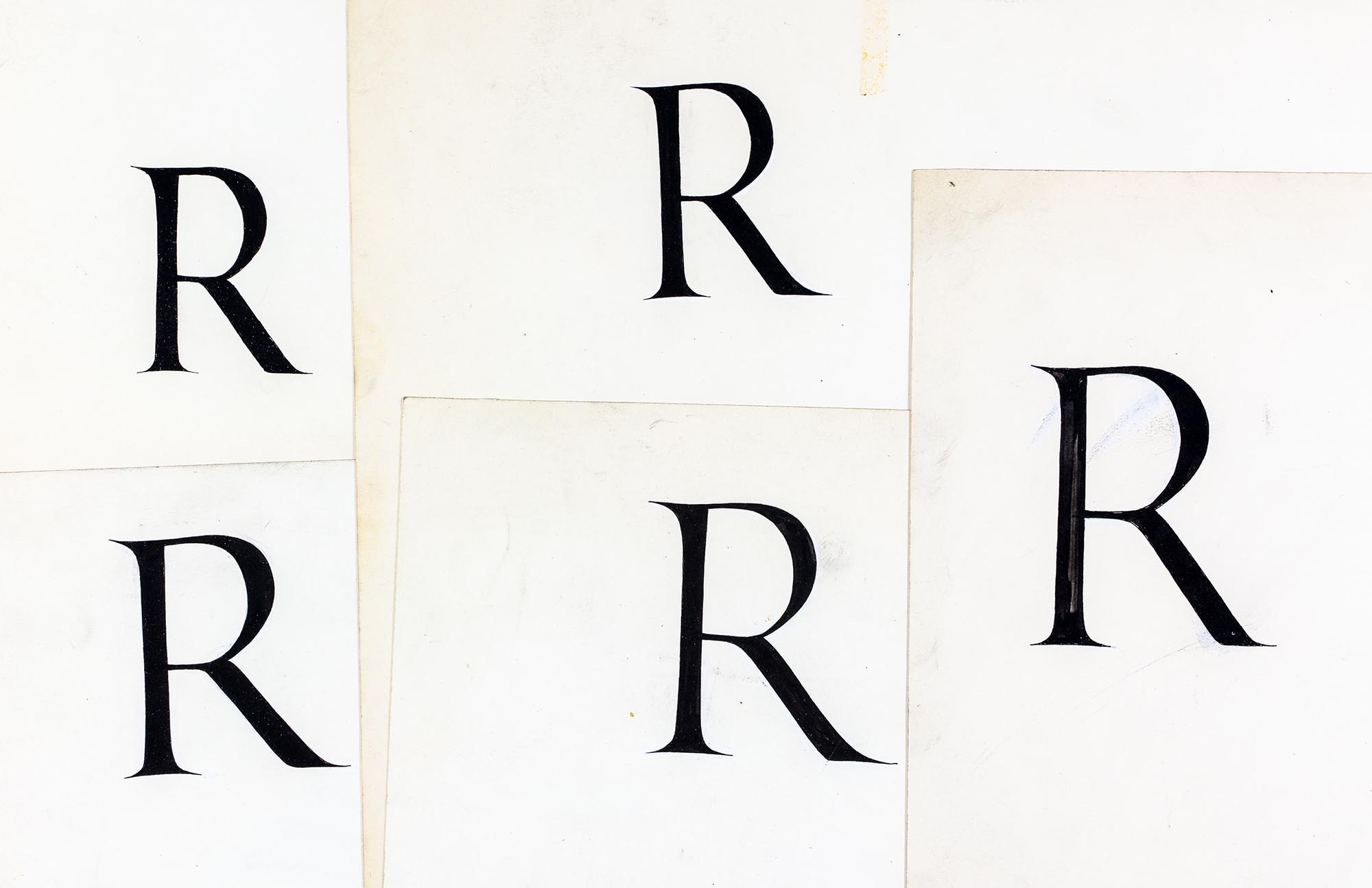
A collection of upper case Roman Rs. Ismar David would demonstrate a free hand R at the beginning of the semester.
Peter Cooper founded the Cooper Union for the Advancement of Science and Art on his fundamental belief that an education should be accessible to those who qualify, independent of their race, religion, sex, wealth or social status. Tuition-free, the school originally offered night classes in applied sciences and architectural drawing and day classes in what was called the Female School of Design. A four-year undergraduate program was established in 1902. Eventually Cooper Union evolved into three schools, of art, architecture and engineering.
In the fall of 1954, Ismar David started as an Instructor in the Art School teaching lettering for 6 hours a week in the evening session. George Salter had recommended him for the post. His other colleagues, at various times, included: Phil Grushkin, Larry Hoffman, George Kratina, Jim McCrea, Charles E. Skaggs and Paul Standard. From David’s perspective, Cooper Union operated as the kind of arts and crafts school he had attended in Berlin and Breslau: professionals taught their respective crafts, giving students the education and experience they would need to function successfully in their chosen fields.
David said that he was the only instructor, who, in his first year of teaching, threw a student out of class. He also recalled advocating unsuccessfully to retain a student who had made a 180 degree turn-around during the semester. He enjoyed the exchange with students and the opportunity to help them prepare for their professional lives. He formulated his thoughts about his calligraphy class in this way:
The teaching of lettering should, I believe, develop the feeling for proportion, design, rhythm and harmony. It should be a training for the eye to discover and distinguish the differences and fine nuances of graphic forms. With this, it should develop the manual discipline and skill required. The student should acquire the feeling of the link to the culture of the past and learn to integrate his own creative conception with tradition, which I believe is necessary for good contemporary design.” 1 Undated “Statement 1” Ismar David papers, box 8, folder 182, Cary Graphic Arts Collection, RIT.
David said of the evening class in 1965, which included Anita Karl and Mary Ahern:
This year’s Tuesday class specifically has been for me a very rewarding experience. We had a remarkably high proportion of very interested students, very eager to learn who deserved our efforts to give them the opportunity to study. The samples of their work which I will submit at a later date for the annual exhibition will illustrate that vividly. 2 April 6, 1965 letter to Professor Wysocky, Ismar David papers, box 8, folder 182, Cary Graphic Arts Collection, RIT.
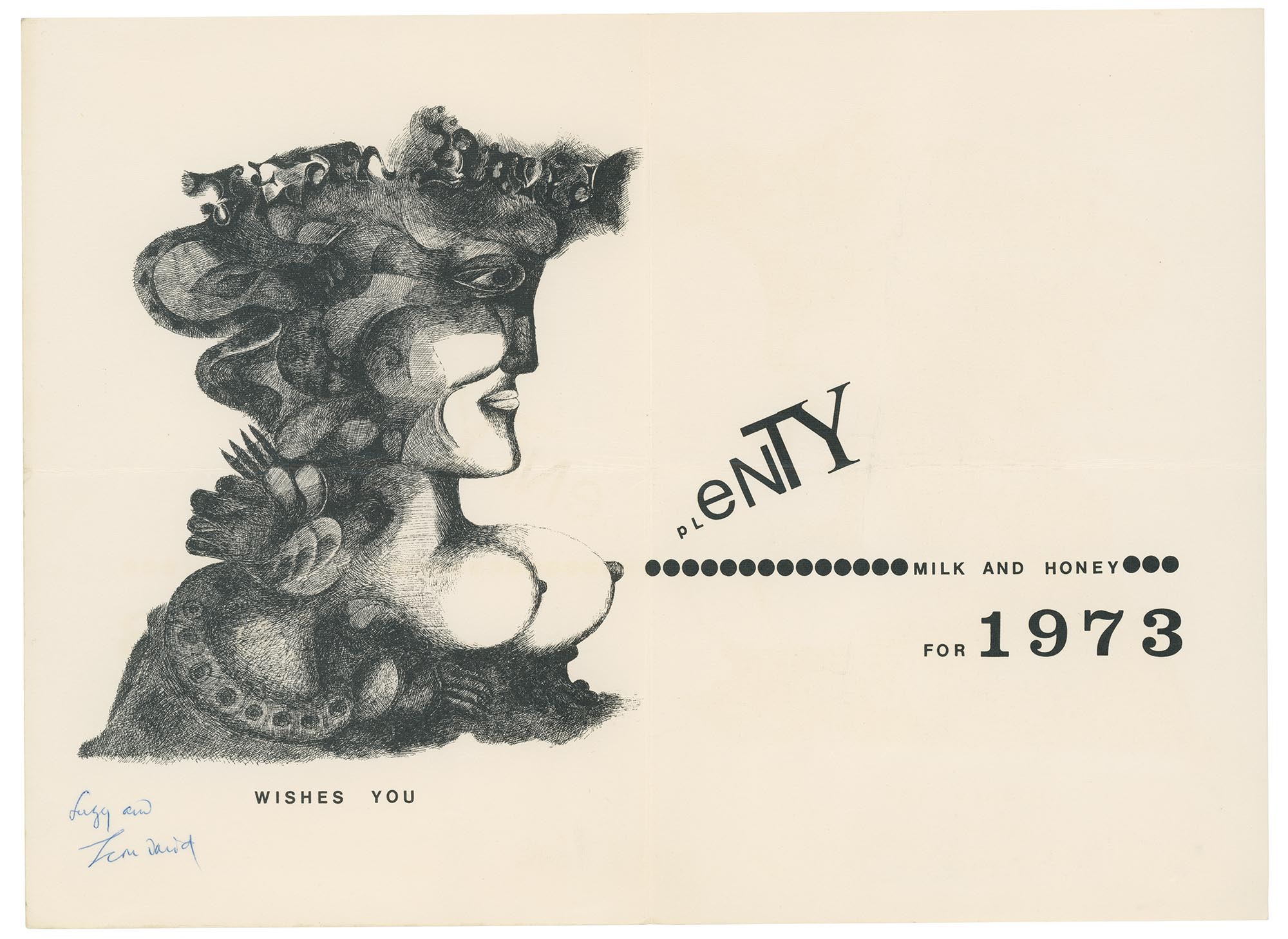
Jean David, 1908–1993, designer, painter and illustrator, multi-media artist.
A 1973 greeting card from Jean David.
Born in Bucharest to a wealthy family, Jean David studies at the Académie Julian and at the École des Beaux-Arts in Paris. He had several exhibitions in his home city and was a member of the surrealist group, Unu, although he never quite felt at home with any particular artistic philosophy. He fled Romania for Palestine in 1942. After the British seized the boat carrying him and 12 other refugees, he spent two years at an internment camp in Cyprus. He joined the British Navy immediately on his release.
David lived in Jerusalem for a while, was one of the pioneers of the Ein Hod artist’s colony, and finally settled in an apartment, overlooking the sea, in Tel Aviv. His immensely popular posters for tourism, interiors for El Al aircraft and terminals, large scale works for hotels and cruise ships made him an almost ubiquitous part of Israel’s graphic landscape, both domestically and internationally, in the 1950s and ’60s.
The Israel Exposition listed him as one of its exhibitors (courtesy of the Ford Motor Company).